Histogram is Out of Shape
Dear Bubbles:
I shoot in JPEG format. I’ve heard that my histogram should look like a bell curve. I can never get it to look like that. What am I doing wrong?
~Feeling Exposed
Dear Feeling Exposed:
I’m glad you’re paying attention to your histogram!
Histograms are one of the most powerful tools in digital photography. It provides us instant feedback on how much light our camera records during an exposure. It helps us understand whether the camera captured the appropriate amount of light and if we need to adjust the quantity of light. It’s data we can use to determine if we’ve made a desirable exposure, right when we make the exposure. (Unlike film where we had to wait days and weeks to know…).
On the X-axis, the left side represents the shadows captured in the image, while the right side shows the highlights. The middle displays the mid-tones. On the Y-axis, the jagged peaks and bundles of lines tell us how much of each tone we’ve recorded (formally known as “frequency”).
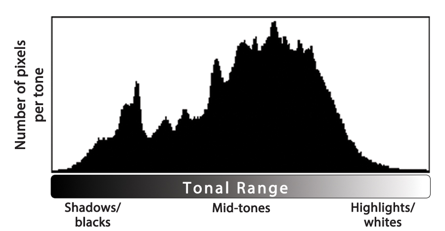
Generally speaking, when photographing in JPEG format, the histogram for a correctly exposed image will show an even distribution of tones across the graph. This means the spacing on the left should equal the spacing on the right. Regardless of its shape, the middle part of the histogram should sit balanced between the two ends. You shouldn’t see any spikes on the far left or far right of your histogram. That’s called “clipping.” Clipping tells us we’ve exceeded the capabilities of the camera to record shadows and highlights respectively. No amount of processing can gain detail in the areas where we’ve clipped the shadows or highlights. (If parts of your photograph blink or flash at you on your LCD, it’s your camera screaming at you to “Fix me! Fix me! Fix me!” because you won’t be able to later…more on that in a minute.) Spikes in the middle of the histogram are fine—it’s an indication the image has an abundance of that specific tone.
The histogram above is a JPEG histogram I could live with. No spikes off either end. It’s maybe slightly shifted to the left, if I get picky. Otherwise, the spacing on the right and left sides are about equal.
The histograms below are trouble because of the spikes on the ends and the imbalance of tones across the graph:
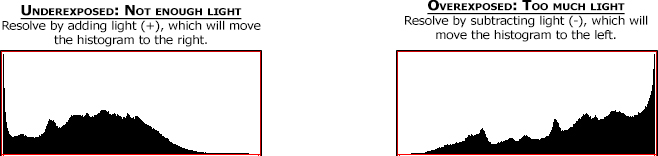
We would fix both of these scenarios in camera using our exposure value compensation (via the “+/-” dial or button) in Program, Aperture-Priority, and Shutter Speed-Priority modes or through adjusting shutter speed/aperture in Manual mode. How much? It depends! You’d want to eliminate the spikes on the edges of the histogram and you want to balance the “guts” of the graph in the middle as best you can. Every image will require different adjustments.
JPEG (which stands for “Joint Photographic Experts Group”—random useless knowledge…) is a lossy format. Each time a photographer modifies and saves a JPEG photograph in processing software, the file progressively loses data and image quality degrades. This means a photographer shooting in JPEG format needs to adjust his/her exposure in camera, and not rely on processing software, to capture this balanced distribution of tones. Watching your histogram is key in accomplishing this.
(Note: If you are photographing in RAW format, we aim to push our histogram shape as far to the right as possible without blowing out the highlights, which is known as the “Expose to the Right,” or ETTR technique. RAW, which is not an acronym–more random useless knowledge!–is a lossless format. ETTR maximizes the amount of data your sensor records to give you flexibility in moving all that rich data around in processing later. One format is not necessarily better than the other. The goals for JPEG and RAW formats simply differ. Thus the positioning of the histogram within the graph should differ as well.)
Your camera is constantly metering (monitoring) the light levels in your composition. Every time you move your camera, your histogram changes. Even if you kept your camera still, natural lighting conditions can—and do—change frequently which also affects your histogram. Every scene, every lighting scenario renders a different shape on the graph.
When we see a histogram that’s shaped like a bell curve, it tells us a few things about the light we’ve recorded:
- We’ve recorded an abundance of mid-tones.
- We’ve recorded few shadows and highlights.
This tells us we have even illumination across the scene, likely from shooting in shadowed area or on overcast day. It’s also possible the photographer used a diffuser to reduce contrast intentionally. So long as this bell-curve-shaped histogram displays a balanced distribution of tones, and the shadows and highlights aren’t clipped, it’s an acceptable histogram.
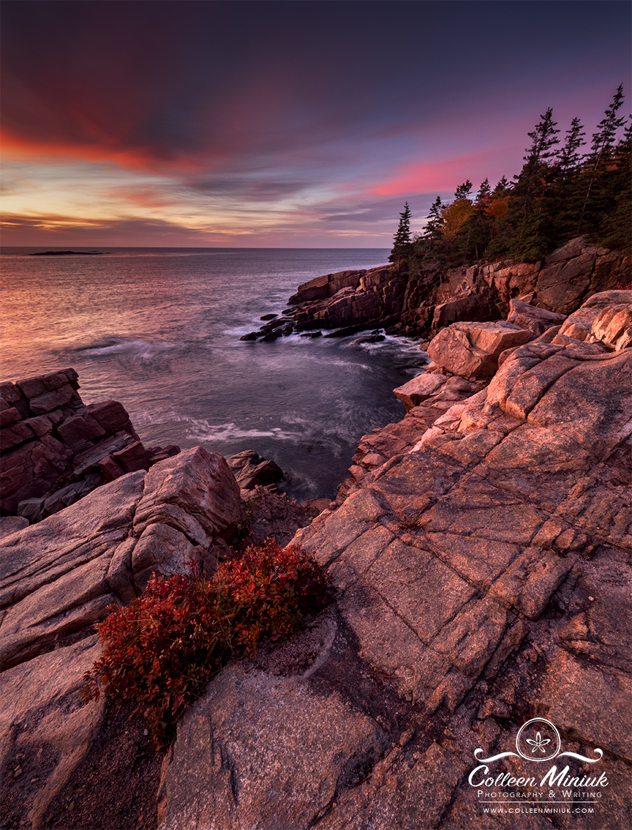
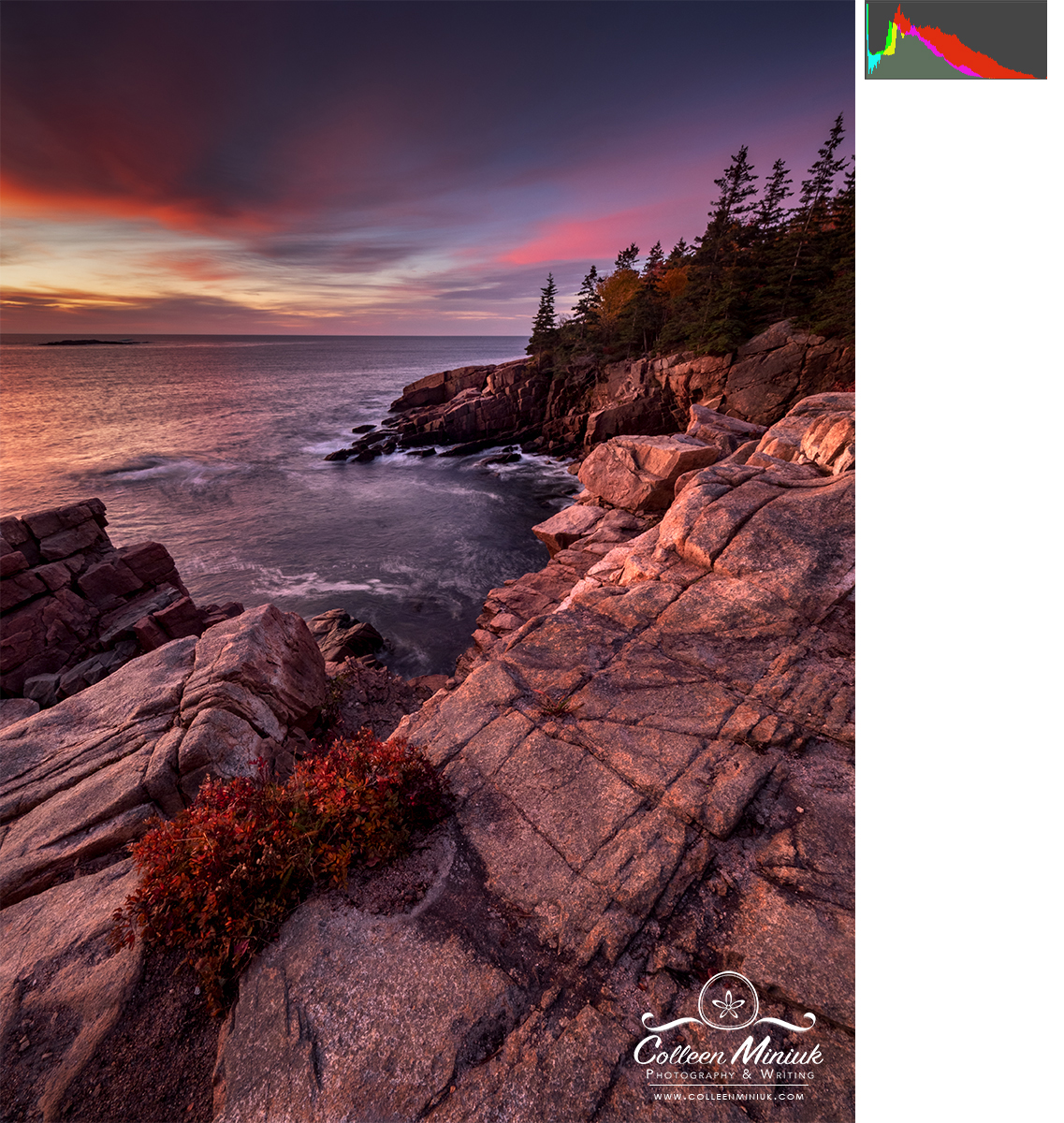
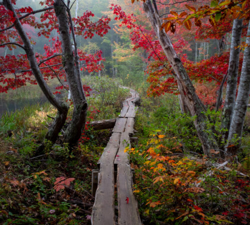
Here’s an example of a bell-shaped curve histogram from an overcast day in Acadia National Park in Maine:
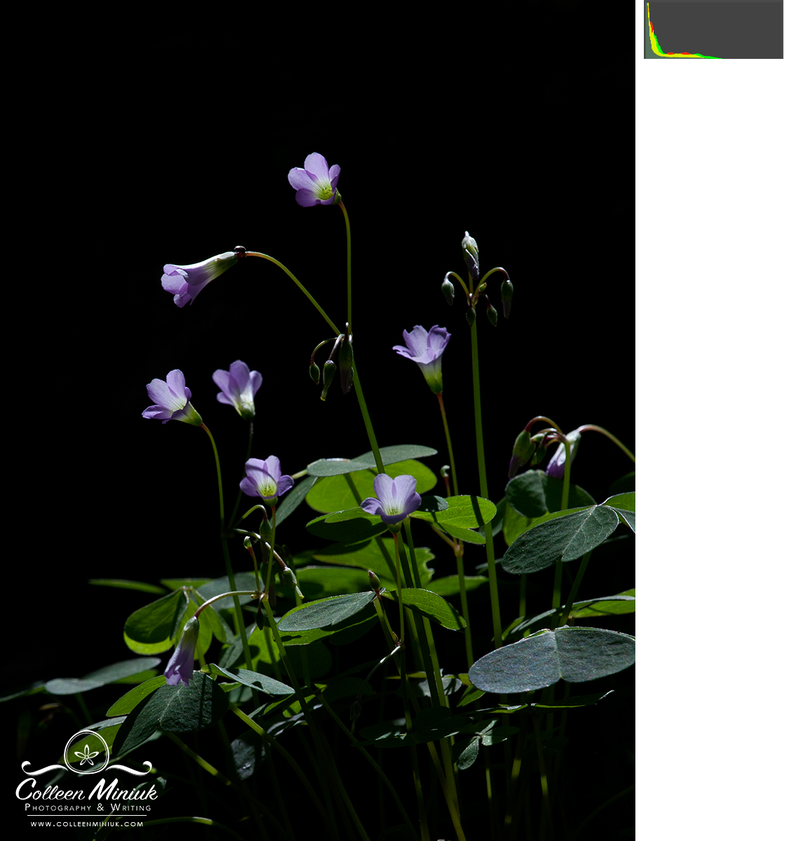
But what if we’re shooting backlighting? During mid-day? At night? These high contrast scenarios often yield a U-shaped histogram, which tells us:
- We’ve recorded an abundance of shadows and highlights.
- We’ve recorded few midtones.
In other words, it’s the exact opposite of a bell-curve histogram. In fact, when photographing in contrasty light, it’ll be all but impossible to render a bell curve. Sure, some scenes will benefit from a polarizer and/or a graduated neutral density filter to rein in the contrast. Alternatively, you could employ high dynamic range (HDR) imaging techniques to record a broader dynamic range in the final image as well. You could wait for a cloud to come by to soften the light on your scene. But there’s nothing we can do in camera to change the natural lighting conditions.
Here’s an example of a U-shaped histogram, where we see spike of white highlights on the right, spike of black shadows on the left, few midtones between:
Feeling Exposed, since you aren’t seeing bell-curves, I’d guess you’re mostly shooting in high contrast lighting conditions–and you’re doing absolutely nothing wrong. If it makes you feel any better, I sorted through hundreds of images for this post, looking for an image with a perfect bell-curve-shaped histogram to show you. I had very few to chose from…
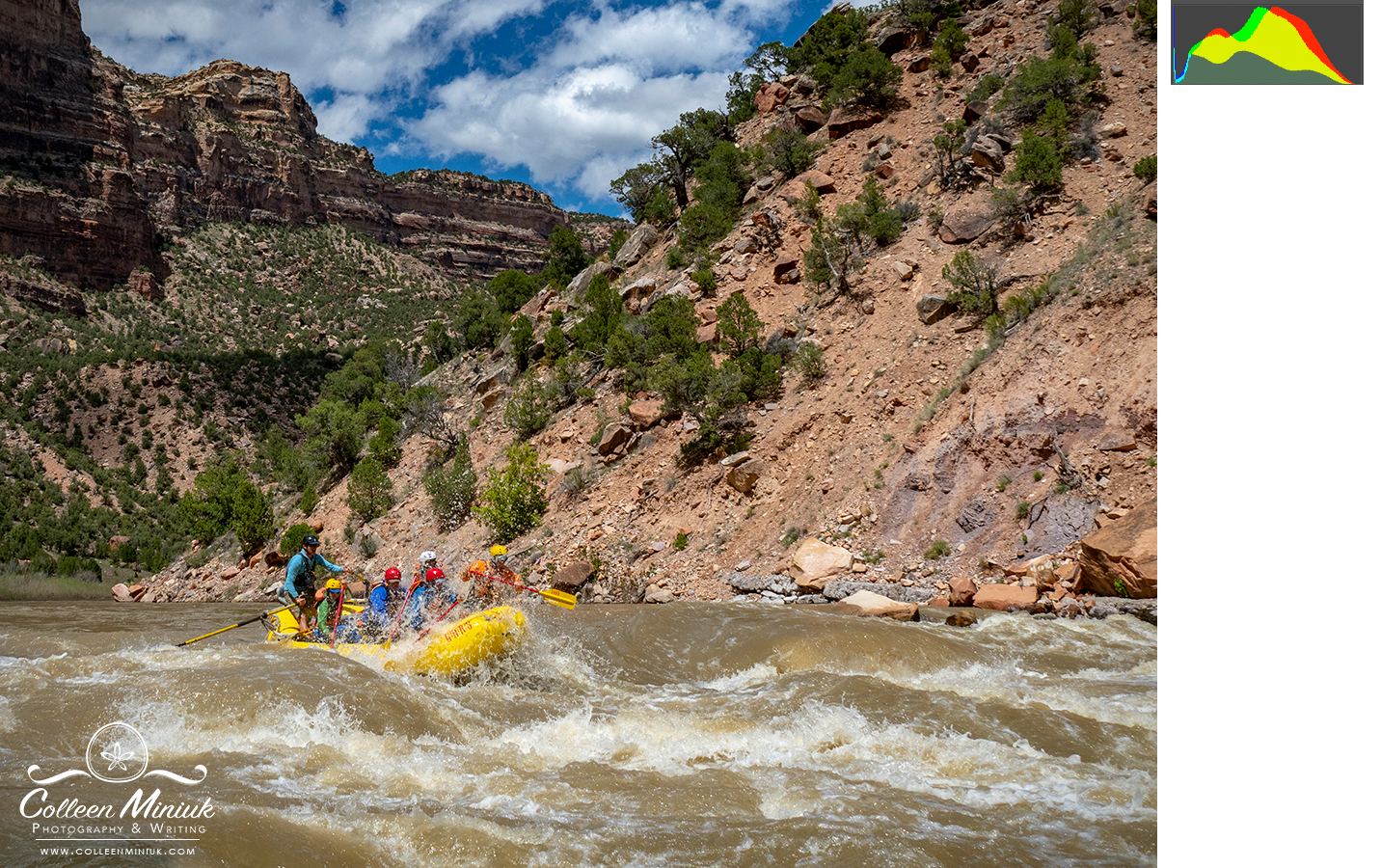
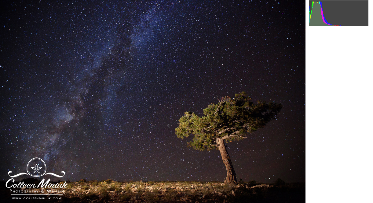
My histograms are all over the board, depending on what I’m photographing. Here are some examples:
Top/backlighting (where the lit subject is against a shadowed cliff wall):
Partly cloudy mid-day (read: high contrast reduced by partial cloud cover):
Night (when we’d expect a lot of blacks. It’s dark!):
Civil twilight:
Because the histogram displays data, it won’t lie to you. The photograph rendered on the back of the screen will lie to you, however. The brightness of your LCD, the glare from the sun, and other factors can make the image you see on the back of your camera seem brighter or darker than it’ll look on the computer screen. Trust your histogram. Always.
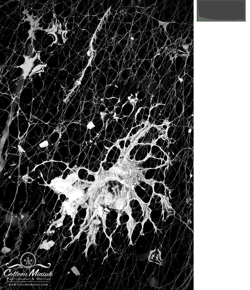
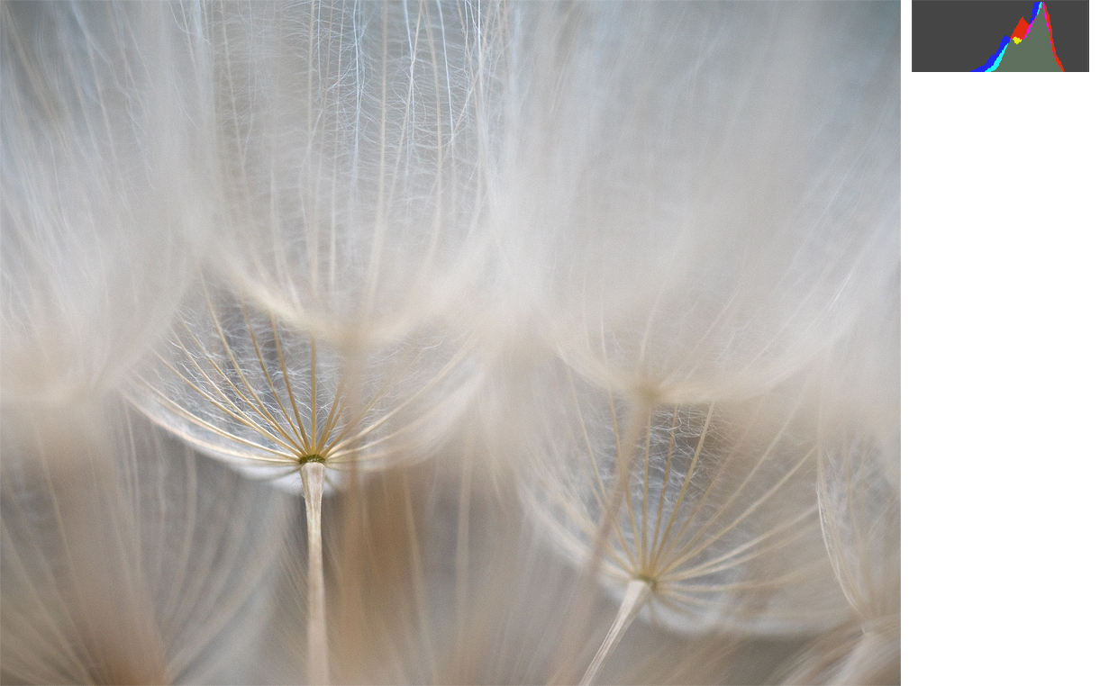
BUT! Just because a histogram tells you something, doesn’t mean you don’t have to listen to it. It’s data. Not an edict. For example, for the image below of the inside of a goatsbeard seed head, I intentionally chose to keep the exposure lighter and with few dark shadows to keep the mood soft and wispy. The histogram is shifted to the right with no highlights or shadows–it’s not evenly distributed. On purpose.
If I made adjustments to the histogram so that it was evenly distributed across the tonal range, this is what would result:
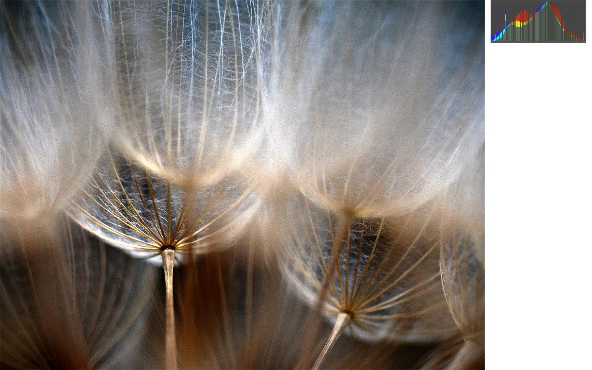
Um, no. Just no. That’s a train wreck.
(In case you’re wondering, the lines in the histogram in the second image represent gaps in data–that’s what happens when you make adjustments to a JPEG image in processing. You lose data. No bueno.)
When it comes to histograms, keep two things in mind. One, the distribution of the tones across the graph is more important to monitor than shape. A specific shape isn’t necessarily right or wrong, good or bad. Aim for “appropriate” for your composition and your lighting conditions. To train your eye in this regard, study the tones in your past images. Determine what tones you have and estimate how many of each (a lot, a little). Then guess what your histogram looks like. Compare your answer to the one you see in your processing software or on your camera’s LCD.
And then two, you’re in charge of making the image, not the camera. You decide how you want your image to look. Use your understanding of the histogram to help you make deliberate choices for your exposures. That’ll keep your histogram in line and in shape.
Be well, be wild,
~Bubbles
Have a question about photography, art, and/or the creative life? Need some advice? Send your question to Dear Bubbles at colleen@colleenminiuk.com to be possibly featured in a future column post. (If you’d prefer a different display name than your real first name, please include your preferred nickname in your note.)


One Comment
Pingback: