Seeing the Light
Dear Bubbles,
How do you see contrast?
~Muhammad
Dear Muhammad,
Verrrrrry carrrrrrrefully!
The very word “photography” derives from the Greek words “phos” (light) and “graphis” (paint) which together means “to paint with light.” Without light, a photograph does not exist. Integrating only light into your frame, however, is not enough to create an effective image. We must consider visual contrast between light AND shadow.
The Merriam-Webster Dictionary defines contrast as a: “degree of difference between the lightest and darkest parts of a picture.” It’s the range of variation between highlight and shadow, white and black. We say a photograph has high-contrast when the difference between the ends are extreme, when the image shows a lot of white and black tones with a few or no midtones in between. A low-contrast image is the opposite. A low-contrast image shows few white and black tones but is rich with midtones.
Both high and low contrast images have their place in photography but they achieve different objectives. High contrast images create the illusion of depth; display pronounced lines, shapes, and layers; portray a mood or story; increases visual energy; and grab viewers’ attention. We tend to see high contrast lighting during direct lighting conditions and midday. Low contrast images tend to feel more peaceful, dreamy, soft, and ethereal. Heavy midtones occur in the twilight hours, on overcast days, and in shady areas where the lighting is more even. A diffuser can also create even illumination—or low contrast lighting—over smaller scenes.
Which should you incorporate into your photographs? As with everything in photography, it depends. It depends on your vision. Before we can decide which direction we wish to go with our photograph, it’s important that we see this contrast “out there” in the field or with our subjects before we snap the shutter. For some of us (like me), this is easier said than done.
Seeing contrast did not come naturally to me. It wasn’t until 1997—five years before I picked up a camera—that I realized I only saw light, not shadows, in the outdoors. My dear friend Jen, who is a hobbyist painter, pointed out light and shadows dancing across the hillsides all around us one evening while we were on a backpacking trip in Joshua Tree National Park in California. I tried to pick out shadows on my own in my everyday life afterwards. I can’t say I was very good at it.
Six years later, in 2003 (two years after I took up photography), I attended my first photography workshop. I showed 10 of my images, ones I didn’t like but couldn’t tell you why, during a one-on-one critique session. During his review, the instructor said “You understand composition, but it’s clear you do not understand light.”
He was right. He showed me which of my images displayed effective contrast and which did not. As he talked, I remembered Jen pointing to shadows on jagged cliffs in Joshua Trees. Enlightened (pun intended), I realized I needed to be more mindful in seeing the difference between light and shadow before I photographed.
For some people, seeing the contrast comes as natural as brushing their teeth. For others (like me), the ability to see this difference requires mindful study and practice. If I can learn to see contrast, I know you can too. Here are some ways to help:
Act like the sun: Find a small object like a coffee mug, apple, or even your camera. Set it on a table or the floor of a dark room or area of your house. Grab a flashlight. Using your flashlight, illuminate the side of your object. Notice the highlight. Notice the shadow. Notice how the highlight and the shadow interact. Now pretend your flashlight is the sun moving across the sky. How do the highlights and shadows respond as you move the light source around? Now go out into your yard and pick an object. Find the shadows. Find the highlights. Try this in the morning, noon, and evening. How does the lighting characteristics change over time?
Analyze your photographs: Start simple. Pull out 10 of your images. Any images. For each one, identify the highlights. Identify the shadows. Then define the direction, quality, and quantity of light for the scene. Where was the light coming from relative to your subject matter (direction)? What type of weather conditions were you experiencing at the time—direct sunlight, cloudy day, etc. (quality)? What time of day was it (quantity)? If you need some guidance with this—warning, shameless self-promotion—pick up a copy of my “Seeing the Light in Outdoor Photography” eBook at https://www.thepocketinstructor.com.
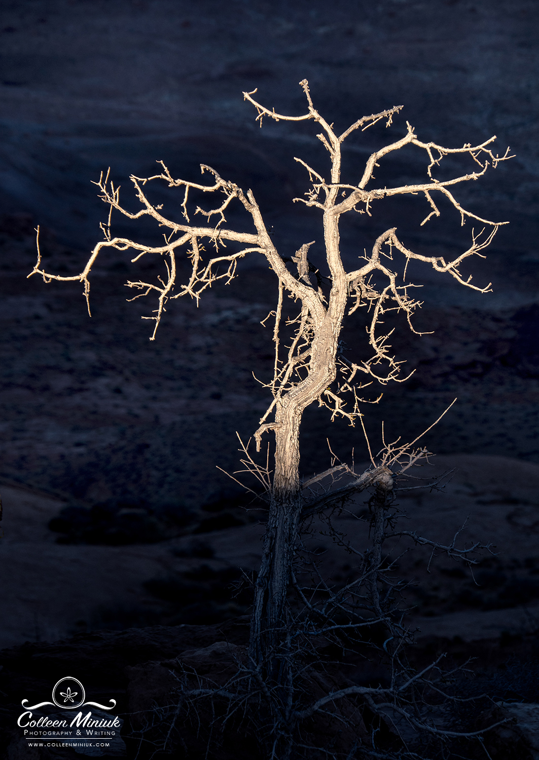
Analyze other people’s photographs and artwork: After my image critique in 2003, I got in my car and went to the library to study the works of Ansel Adams, Galen Rowell, and David Muench. Now, with the advent and accessibility of iPhones, computers, and the internet, you don’t even need to get out of bed to do this. Instead of mindlessly flipping through social media, use it as a tool to help refine your eye. When you see someone else’s photograph, especially one you really like, study it as you did your own. Where are the highlights and shadows? Is it high or low contrast? What do you think their histogram looks like (more on the histogram in a second)? How did they use light to convey depth, emotion, story, and attention? POP QUIZ! Analyze the photograph at the top of this post. Where are the highlights? Where are the shadows? (I picked an easier one on purpose…) Is this a high-contrast or low-contrast image? Why? What do you think the histogram looks like for this image? So you don’t cheat, I’ve posted the answer at the bottom of this post.
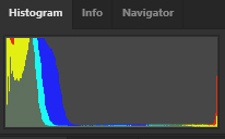
Know how to read your histogram—and read it often: As your analyzing your images, other people’s images, and as you’re making your images, try to guess what your histogram will look like. As a reminder, a histogram is a graphical display of the light your camera collected during the exposure. I check mine after every frame. A U-shaped histogram—one where the tones are spread apart on the ends of the graph—indicates high contrast. A bell-curve-shaped histogram—one where the tones are bunched together—indicates low contrast. To get more details on histograms and what the various shapes mean, read my post on “Histogram is Out of Shape” at https://dearbubbles.com/2020/03/histogram-is-out-of-shape. Note if you are photographing in RAW and applying the “Expose-to-the-Right” (ETTR) technique to capture a large quantity of data, your image will look low contrast (i.e. possibly ugly) on the LCD screen on your camera even if you’re photographing a high-contrast scene. It’ll look washed out—and that’s OK! You’re intentionally not capturing blacks because there are less bits (data) in those tones. You can add the contrast later in processing software—if you wish to do so.
Do a tone check in-camera in the field: Since it’s such a strong visual element, sometimes color acts as noise and gets in the way of seeing tonal contrast. So get rid of it (for a minute)! The camera displays a JPG rendition of your image on your LCD screen (even if you’re photographing in RAW). To change how this looks, in your camera’s menu, change the Picture Style/Control to Monochrome. Once you make a photograph, you’ll see a black-and-white version. Analyze your frame as you did above—this is the tone check. If you’re photographing in RAW, all the data—including the color data—is retained so you are not actually changing the image to monochrome (you are if you photograph in JPG, though). The file will display the color in your processing software.
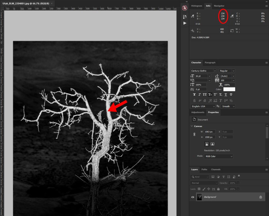
Do a tone check in processing software: Even if you have no plans to turn your photograph into black and white, convert your image to monochrome temporarily so you can see the tonal contrast more clearly. If you have a hard time finding the separation in tones, use the Info window (in Photoshop) to help. Move your cursor over different parts of the frame. The closer the RGB values (the second number listed) are to “0,” the darker the tone. (Red=0, Green=0, and Blue=0 is pure black.) Those areas that render “255” for RGB values are closer to highlights. (R=255, G=255, and B=255 is pure white.) Those hovering around the 120-130 range are considered midtones. Compare your findings with your image’s histogram. Does what you see with your histogram and RGB values make sense?
Play with the contrast slider in processing software: Pick out a few of your images to play with. Crank the Contrast slider in processing software to the left and right. In Adobe products, left will lead to less contrast. Right will lead to more. Contrast is like adding salt and pepper to taste. Add more or less as you wish depending on what you’re trying to accomplish? What looks best for your image? (Note: what looks great for one image may not look so great on the next. There isn’t an easy-peasy, one-size-fits-all solution out there for contrast.)
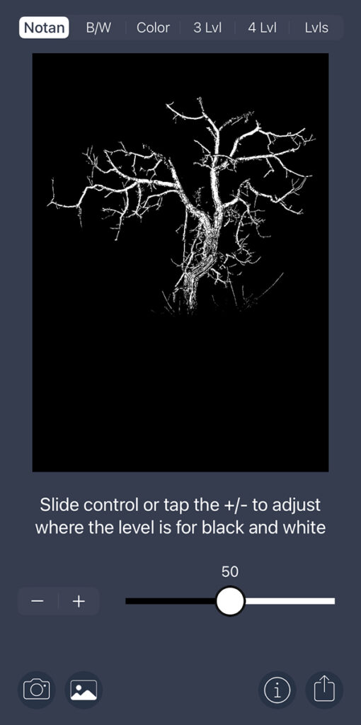
Run your images through the Notanizer app (available for Apple and Google devices): Notan is a Japanese concept meaning “light dark harmony.” It’s relates to the relationship and structure between light and dark tones in visual design. Think the yin-yang symbol—it has perfect Notan. If you’d like to not only see the tonal contrast for your image but also the balance between whites and blacks within your composition, download the Notanizer app and load your photographs into them. You can then make compositional choices, like changing your perspective and adjusting your overall balance, to include more or less whites or blacks. Here’s a decent demo of what the app can do (in terms of painting—it applies to photography just the same): https://youtu.be/jpj6nPluM3I. To get a more practical explanation of notan (again, in terms of painting), watch “Notan–Exploring Shape and Color” by painter Mitchell Albala at https://youtu.be/7AS9zvjwmUM. Here’s what the notan looks like for my photo at the top of the frame when I ran it through the app:
Visualize light and shadow for a location: It’s one thing to see the light, another to incorporate it deliberately into your photography. Apps like The Photographer’s Ephemeris, Photo Pills, and Google Earth’s sunlight feature can help photographers visualize how the land will reflect and absorb light throughout the day. I’m not one to use these tools to dictate whether or not I go to a specific location, but they do help me understand what I’m likely to see once I get there. I at least know what to look for.
I can say from experience that mastering observing and incorporating contrast in regards to lighting and tones will make a difference in the quality of your images. Give yourself patience and time as you work through this. As with everything, practice will help make seeing contrast second-nature.
But…once you see the light, I’m afraid it’s not the end of the tunnel…you have more homework to do…
Seeing light (and shadow) still isn’t enough to create an effective image. After all, the Merriam-Webster Dictionary also defines contrast as a “juxtaposition of dissimilar elements (such as color, tone, or emotion) in a work of art.” Contrast also applies to things like, but not limited to:
- Colors: Blue and orange convey very different emotions (cold and warm respectively). Red and green too. Red triggers a fight-or-flight response while green is more harmonious and peaceful. Even within one color, there are differences between hues and saturation. For example, cyan (high-contrast) and powder blue (low-contrast) convey different energy levels. Dig out a color wheel, understand color meanings, and study the relationships between colors, especially between complimentary colors.
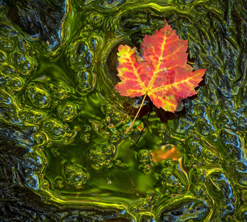
- Textural: Sometimes the subject matter possesses certain unchangeable characteristics. A smooth subject conveys a different perception than a rough one. Sometimes we can change a surface’s appearances by controlling our depth-of-field and rendering parts of our photograph in (sharp) or out of focus (blur).
- Conceptual: We can convey opposites and juxtapositions through subject matter alone. Balance characteristics within our compositions like short and long, big and small, square and round, straight and curvy, moving and not moving, dead or alive, etc. to create contrast and interest in our scenes.
Teaching yourself how to see these contrasts can make the difference between a photo you hang on the wall and one you throw out. It can also help us appreciate the duality in photography (and in life). Light exists because of the dark, dark because of the light. Opposites and juxtaposition provide balance.
Be well, be wild,
Bubbles
P.S. How’d you do with the pop quiz? The histogram for the photo at the top of this post, which I deem high contrast, looks like this:
Have a question about photography, art, and/or the creative life? Need some advice? Looking for inspiration? Send your question to Dear Bubbles at colleen@colleenminiuk.com to be possibly featured in a future column post. (If you’d prefer a different display name than your real first name, please include your preferred nickname in your note.
If you liked this post, please consider supporting Dear Bubbles either through a monthly contribution through Patreon or a one-time donation through Buy Me a Coffee. Learn more about both at https://dearbubbles.com/support.


2 Comments
Mary
Very helpful. Thanks!
Bubbles
Awesome, glad to hear Mary!