Process on Processing
Dear Bubbles:
How much post-processing do you do on your photos?
~Patty
Dear Patty:
How much post-processing do I do on my photos? None.
How much processing do I do on my photos? As is the answer to most questions in photography, it depends.
Lest you think I’m getting snobby with semantics, as a writer, words matter. They should for photographers too. For whatever reason, us photographers like to sometimes attach prefixes to words without fully comprehending the change in meaning. Yet, being mindful—paying attention to detail—in all we do, not just when snapping the shutter, is one way to become a better photographer.
Two often misapplied references in particular make the two marbles in my brain spin. “Post-processing” vs. “processing” is one. “Pre-visualization” vs. “visualization” is the other.
Processing is the act of using editing software on a computer to translate data recorded by a digital camera into a readable and usable file. In more artistic speak, it’s the mechanism photographers using digital technology employ to bring their expressive vision to life. It’s the equivalent of developing exposed film into usable negatives or positives (slides) in a traditional darkroom.
Post-processing is everything you do after processing, including going for a walk, taking a nap, and drinking bubbly. So I actually do plenty of post-processing. Just none of it involves sitting behind a computer and processing images. But, to demonstrate my remarkable talents, I have post-processed (i.e., drank bubbly) and processed my images—get this—AT THE SAME TIME. I know, I know, it’s taken years and years of practice to reach such a high level of performance. I tell you what, though, my images really start to look amazing on the screen after about two glasses…
ANYHOW! While The Great and Almighty Gods of Photography—the internet—enjoy bantering about whether we should or should “manipulate” our images, how much “manipulation” is too much, and other meaningless minutiae, like it or not, processing is an integral part of digital photography. If you photograph in RAW format, which is not an image but rather just a file with a bunch of data in it, decoding the file is required if you ever wish to see a photograph result.
I’ll admit, processing is my least favorite part of the photographic process. I spent almost 10 years as a software engineer/project manager at Intel sitting in front of a computer screen. I didn’t leave my corporate job and become a full-time photographer to do more of that. I much prefer frolicking among bubbles, scraping my hands against sandstone, and marveling over the shapes of the clouds in the field. That doesn’t mean I don’t understand the value and magic of processing. I do, and I get enjoyment out of seeing a visual idea come to fruition on the screen and in print. I simply don’t like sitting in front of a computer screen for very long. In that respect, I’d call processing “Type 2” fun: it’s maybe a little miserable while I’m doing it, but fun in hindsight once I’ve done it. Ah well, we all must suffer for our art…
While I employ a consistent processing approach, each individual photograph gets a different treatment depending on what the RAW image looks like, what my vision is, and the space in between. My goal with processing is to create a single master file that represents my vision from which all other output (for print and web use) derives. To accomplish this, I:
1. Prep the RAW file for conversion into a readable and usable photographic format.
After I open my RAW file from Adobe Bridge into Adobe Camera Raw (ACR, Adobe’s RAW converter which looks and feels similar to Adobe Lightroom’s Develop module), I may futz around with the exposure, contrast, highlight and shadow, white and black, and clarity, texture, and dehaze sliders to see their impacts. Occasionally, I might use the graduated neutral density filter to darken the sky or other large chunks of an image. Or I may not. Each photograph results in different settings. I don’t use presets or recipes. For the most part, though, I leave the file alone until I bring it into Photoshop. That said, I always check my white balance in ACR. (I describe my step-by-step process for this in my Restoring Balance article.)
2. Make global adjustments.
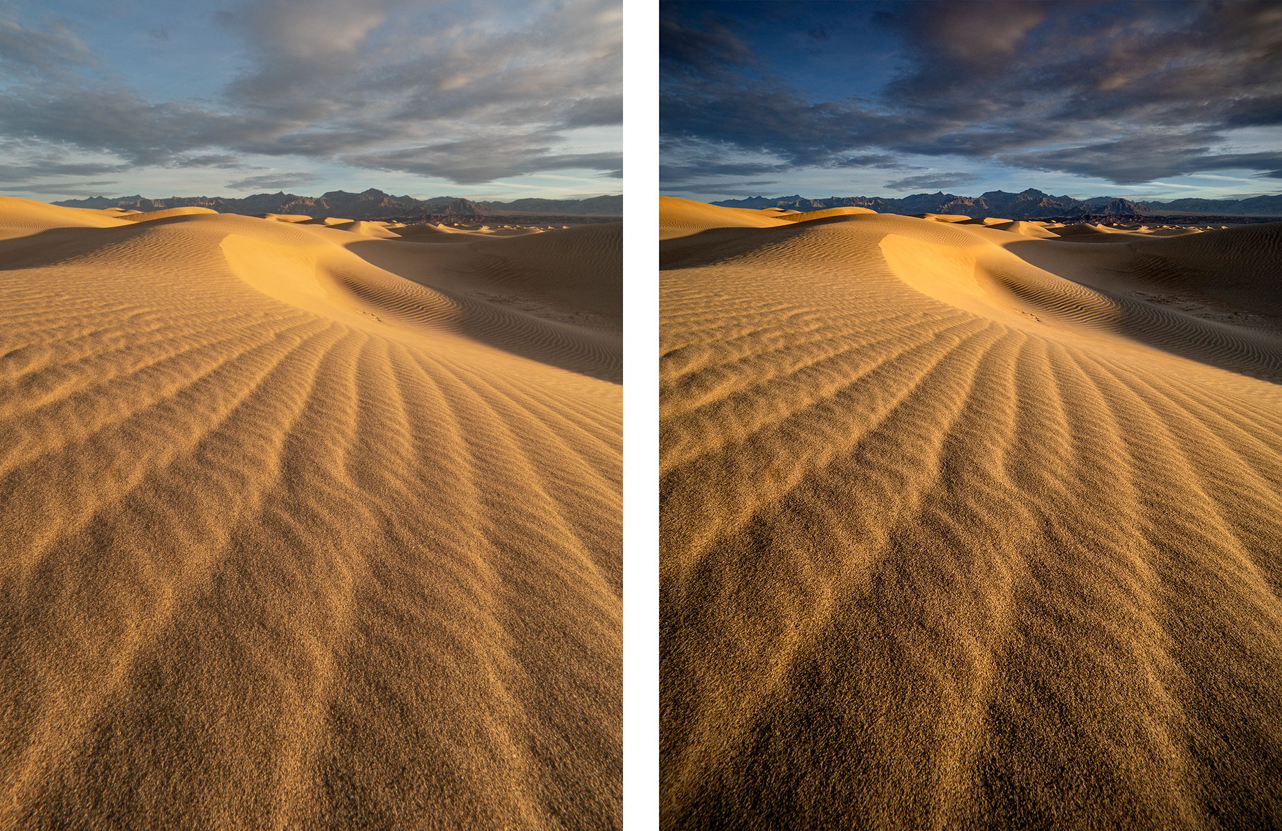
If you subscribe to the “Expose-to-the-Right” approach for RAW files (where we aim to push our histogram shape as far to the right as possible without blowing out the highlights to gather as much data as possible when we shoot), the file coming out of the camera lacks contrast. More precisely, the file may have an abundance of highlights and midtones, but a shortage on shadows. I tap into either Levels or Curves to adjust the black point (and sometimes the white point too) to spread the data I’ve collected across the entire tonal range.
Then, I apply a Hue/Saturation layer adjustment to modify the Hue setting of cyan from 0 to +5 or +10. For whatever reason, my Olympus OMD EM1 Mark II camera likes to super saturate blue skies. The cyan color that results looks neon. It actually pains me to look at it. Like nails-on-a-chalkboard kind of pain. So, yeah, fixing that in Photoshop is a priority for me.
After that, almost all of my images get a slight vignette. Vignettes solve all world problems! (Except for COVID-19 apparently…) By darkening the corners using Photoshop’s Lens Correction or using the Radial filter in ACR, I’m able to subtly hold the viewer’s eye inside the frame with brighter tones. In Lens Correction (under the Custom tab), I usually start with -15 or -20 on the vignette Amount setting and leave the Midpoint setting at 0.
3. Make localized adjustments.
For every individual image, I analyze the balance of tones and dodge (darken) and burn (lighten) areas accordingly. Building off the notion that a viewer’s eye will go to the brightest parts of the frame, to draw attention to parts I want the viewer to see, I’ll lighten the area through Curves or Levels with a mask. I do the opposite to hide supporting details; I darken the areas I don’t want a viewer to notice.When you create an adjustment layer like Curves or Levels, the layer comes with a linked mask. It looks like a white box to right of the adjustment in the layer. You can fill this box, the mask, to hide the adjustments you’ve made. Remember this: “White reveals. Black conceals.”
To do so, I change my foreground color to black, then use ALT-DELETE on my PC to fill the mask. (Alternatively, you can select Edit/Fill from the menu) Then, I switch the foreground color to white and select a soft brush from the Brush tool. With the brush, I “paint” over areas I wish to lighten. (Or reveal whatever adjustment I’ve done. I use this similar approach with a mask and brush to adjust the hue of a certain color via Hue/Saturation, for example.) You can also do the opposite to reveal a layer by filling the mask with white by changing the foreground color to white. Then use a black brush to hide areas where you do not wish to see the effects of the adjustment.
I also check to ensure my horizon, or the implied horizon, is straight and that I don’t have any Border Patrol issues (i.e., distracting elements like out of focus branches or bright light on the edge of the frame that don’t belong). Rather than crop my composition, which I’ve perfected to my taste in the field and don’t want to compromise, I use the Warp tool. First, I duplicate the background layer. Then I select Control-T (or Edit/Free Transform from the menu). The Warp icon appears at the top of the screen next to the checkmark and cancel icons. A grid will appear over your image, and you can move any part of the image you wish.
Finally, because it seems I’m not able to keep my sensor spotless (photographing in spraying water and sand might have something to do with that…), I touch up dust spots using either the Spot Healing brush or the Clone Stamp tool or both if the blemish falls in a tricky spot in the frame.
4. Prep the file for output.
Once I have a photo finalized, I save it in a TIF format. This file becomes my baseline images for all other output (print or web) in the future.
For print output, I’ll resize the image using Image/Image Size, keeping the resolution at 300 dpi (which my printer recommends). I’ll sharpen using Filter/Sharpen/Unsharp Mask starting at Amount=500, Radius=0.1, and Threshold=0. I’ll increase the Radius 0.1 at a time until I see an effect in the Preview box, then I increase 0.1 more. For a 12×18 print, it’s typically around 0.3 or 0.4. If that’s too much, I’ll decrease the amount to 300 or 400. I’ll save the image as a JPEG with the size noted in the file name and an “s” on the end for “sharpened.” (These settings, as with all the other I’ve mentioned, resulted after experimenting and playing with each over the years. I’d encourage you to experiment with these settings with your own images vs. using these as a strict formula.)
For web-based usages (like presentations, social media, and email), I’ll resize the image using Image/Image Size to size to 10” on the long side. I change the resolution at 120 dpi (which looks best in Powerpoint for some reason…for social media and email, I’d recommend 72 dpi). I modify the color space to sRGB (otherwise it will look muddy on the screen) via Edit/Convert to Profile under Destination Space Profile. Then, I’ll sharpen using Filter/Sharpen/Unsharp Mask starting at Amount=150, Radius=0.3, and Threshold=0. If that’s too much, I’ll decrease the amount to 125 or lower. I’ll save the image as a JPEG with a “p” on the end for “presentation-ready.” If I intend to fling the image into the interwebs, I add my watermark, then save the image again as a JPEG with a “c” on the end for “copyright added.”
(In case you wish to see this process in action—and at the risk of shameless self-promotion—you can view an in-depth demonstration of my processing approach during the two-hour webinar on “Photoshop Processing Techniques Demo” I presented earlier this year.)
Sometimes this process takes five minutes. Sometimes it takes hours, days, weeks even to get to a place that matches what I wish to convey with the world. Sometimes I review an old master file years later and ask myself “What in the hell was I thinking?” and reprocess the original RAW file… The point isn’t to go through this fast or even once for an image. You also don’t need to follow my steps. Each photographer should spend the time to find an productive and efficient approach that fits in with how you wish to express yourself through your photographs. Quality and consistency over quantity and speed.
That said, make sure you leave enough time for ample post-processing. You know, for “Type 1” fun. Like frolicking in bubbles…
Be well, be wild,
~Bubbles
Have a question about photography, art, and/or the creative life? Need some advice? Looking for inspiration? Send your question to Dear Bubbles at colleen@colleenminiuk.com to be possibly featured in a future column post. (If you’d prefer a different display name than your real first name, please include your preferred nickname in your note.)

Don't Go Astray on a Bokeh


2 Comments
Gerry Morrison
Good Post Colleen, I always read and enjoy your post to Dear Bubbles. Because I am still on early versions of Photoshop, etc. I can’t follow all the technical specifics but your approach to photography is like mine. Since I started with 35mm black and white photography and graduated to large format (4 x 5 Linhof Technica) single sheet cameras, I still focus on composition first, and technical adjustments later. Later I converted to digital to be able to do color and actually carry my camera gear. My dark room here in Sun Valley is now a dark library with book shelves which replaced large sinks and enlargers.
Julie and I are starting to market “The Magical Universe of the Ancients, a Desert Journal” but still by on-line methods. We look forward to being able to visit the parks and monuments again.
Cheers,
Gerry Morrison
Bubbles
Hi Gerry! Thanks for reading! I realize some of the technical details may not be relevant to those on earlier Photoshop versions or use an alternative software (e.g. Lightroom, ON1) but wanted to share my step-by-step process in hopes it shared both my general approach and specific settings for those who are struggling in their own process. Ahhhh, I remember the good ‘ole 4×5 days. I had a Wista…it was like a dance to make a single photograph…please say HI to Julie! Love your new book! Be well!