Notan for Better Composition
Dear Bubbles:
Can you please explain notan for me?
~A Big Bubbles Fan
Dear A Big Bubbles Fan,
Thanks for your support and for being a part of this community. I appreciate you! And for sending over your question!
Notan is a Japanese design principle referring to the balance between dark and light within a space. Although artists often simplify this to the relationship between black and white in a composition, the original Japanese term is more nuanced. The word combines two kanji characters: “no” conveying a darkness and richness and “tan” conveying a sense of lightness and paleness.
The concept was originally and primarily used to describe the depth of food flavors (mmmmm….pie…), but it made its way into traditional Eastern ink paintings, then was brought into Western culture sometime around the turn of the 20th century. Painter and printmaker Arthur Welsey Dow, who promoted more wide-spread acceptance to the notan concept, wrote in his book Composition: Understanding Line, Notan and Color: “Notan-beauty means the harmony resulting from the combination of dark and light spaces—whether colored or not—whether in buildings, in pictures, or in nature.”
He went on to distinguish notan from light and shadow, suggesting that notan referred to “an element of universal beauty” while light and shadow were “a single fact of external nature.” (Clear as mud?!)
In their excellent book, Notan: The Dark-Light Principle, authors Dorr Bothwell and Maryls Manfield presented the Yin-Yang symbol as an example of this interaction between black and white. They wrote:
Here the positive and negative areas together make a whole created through a unity of opposites that have equal and inseparable reality. In the Yang and the Yin symbol, as in Notan, opposites complement, they do not conflict. Neither seeks to negate or dominate the other, only to relate in harmony. It is the interaction of the light and the dark, therefore, that is most essential.
I learned about notan several years ago after the confluence of two almost simultaneous events: one, Jeanne Falk Adams (former director of the Ansel Adams Gallery in Yosemite and Ansels’ daughter-in-law) encouraging me to try watercolor painting, and two, digging deeper into the story of renowned painter Georgia O’Keeffe, one of my biggest inspirations.
After trying to paint a blade of grass and the tonal variations in clouds for the first time with Jeanne, I realized I didn’t see the world quite as well as I thought I did. Determined to improve my knack for observing details to aid my photography, I picked up Dow’s book where I ran into the idea of notan. I thought Dow’s name sounded familiar but couldn’t place it until I read a separate book a short time later about Georgia O’Keeffe’s life. According to historical accounts, O’Keeffe learned about notan—a revolutionary idea at the time—during her days at Columbia University from none other than Dow. I finished Dow’s book wanting to know more about notan. A quick Google search led me to Bothwell and Mayfield’s book on notan.
Later, Jeanne and I struck up a lively discussion about effective composition where I brought up Bothwell and Mayfield’s book. Jeanne indicated that Bothwell taught workshops with Ansel in Yosemite years back. Although there isn’t much out there about Bothwell’s interactions with O’Keeffe, it’s well known that O’Keeffe and Ansel were buddies.
O’Keeffe deliberately incorporated notan into her painting process. I asked Jeanne whether she knew if Ansel intentionally considered this design principles in his photographic approach. While Jeanne hadn’t yet found any documented references of Ansel using notan in the historical archives, a study of his work shows that he was masterful at creating balance between darks and lights as well.
And hey, if it works for Ansel and O’Keeffe, it can work for us too, right? Right!
Learning and thinking about notan has changed how I interpret visual design out in the world. It’s also helped me visualize and compose my own photographs with improved structure and separation among visual elements.
Even after reading about it, though, I still found the concept a little nebulous until I found an app—there’s an app for everything now!—called the Notanizer. (For the iPhone: https://apps.apple.com/us/app/notanizer/id1169086981. For the Android: https://play.google.com/store/apps/details?id=com.bigpantsgroup.notanizer&hl=en_US)
You snap or upload a photograph into the app, click on the notan button, and poof! It strips your image down to its most basic visual structure in black and white. Here’s a quick demo of how the app works: https://youtu.be/jpj6nPluM3I
Us photogs use a histogram to visualize our distribution of tones and inform our decisions about exposure—how much lights, darks, and midtones we have recorded in pixels for an image. Recall that the histogram displays data in tonal values from 0-255, with 0 representing pure black and 255 representing pure white. While I don’t have insight into the exact code logic in the Notanizer app, from what I gather with personal experience, the app basically turns pixels with tonal values equal to 0-126 into black and 127-255 into white. No greyscale. No color. No texture. Just straight black and straight white.
Great! But now what do we do with this information? We observe the contrast, placement, balance, and relationship between the structure that remain. Does the composition still work? Does the arrangement of dark and light lead to a strong and unified design? Where does the eye go first? Where does it go next? Where does it get stuck or distract?
Then we make choices to improve our arrangement. Would changing our composition create a more effective interaction between tones and visual elements? How much black vs. white takes up the space within the frame? Is there enough separation between blacks and whites to create forms? What are the relationships between those forms?
Would lightening an area within the frame grab more attention? Remember, the viewer’s eye will go to the brightest part of the frame first. Would darkening an area help us remove attention?
How are the lights and darks interacting to create visual weight and eye movement? Are the dark tones at the top enough to create a downward gravitational pull visually? Or are the dark tones at the bottom providing a significant enough foundation to convey rest and peace? Are there any dark or light tones on the edge of the frame that are distracting or not contributing to the rest of the composition?
Note that we aren’t necessarily aiming for precisely equal distribution of lights and darks only an effective balance between light and darks. Equal distribution will lead to symmetrical balance which creates a sense of peaceful harmony and stability (as with the yin-yang symbol). Unequal distribution will lead to asymmetrical which creates an energetic harmony and dynamic tension. Both are right answers but the path to choose depends on what you’re trying to convey through your visual message.
The funniest thing I noticed when I started “notanizing” my own photographs and paintings were just how dark and heavy they all were. Yikes! I had no idea much of my work was so low key!
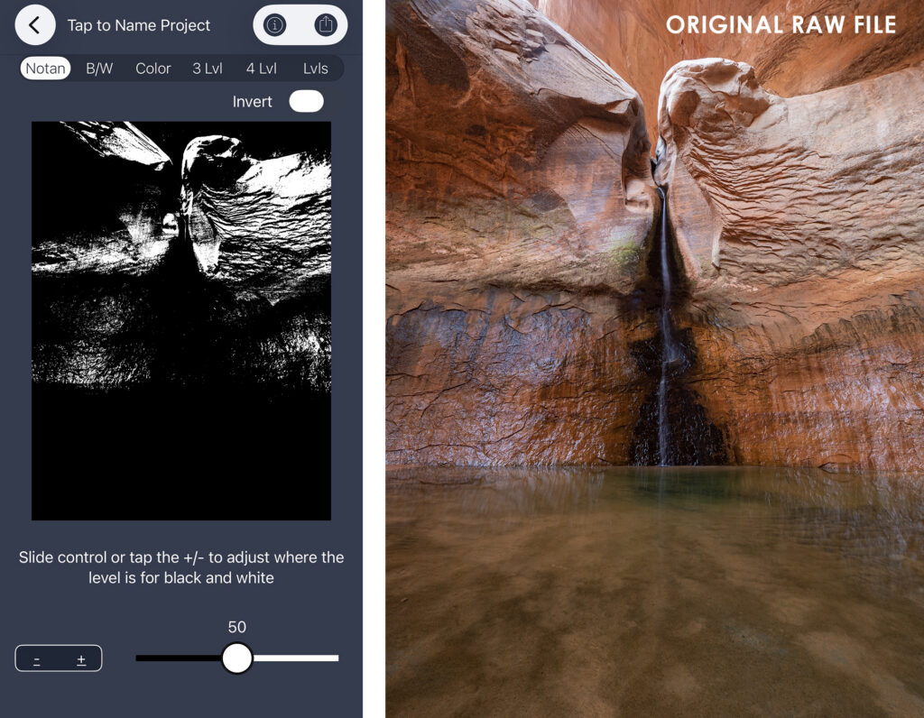
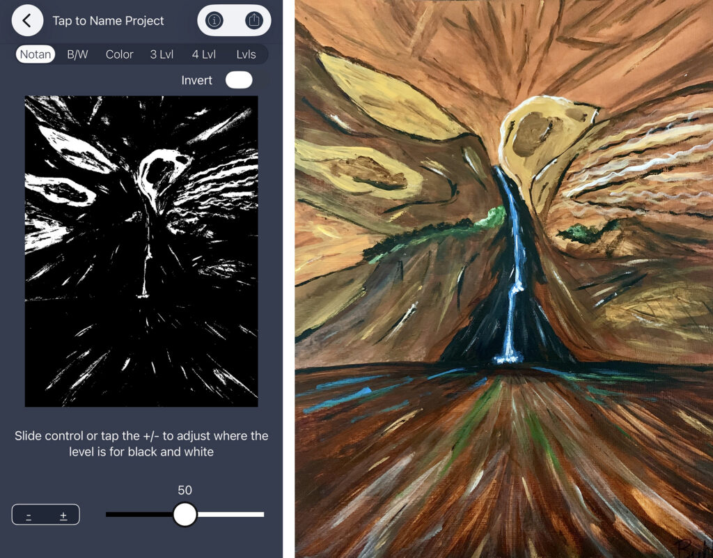
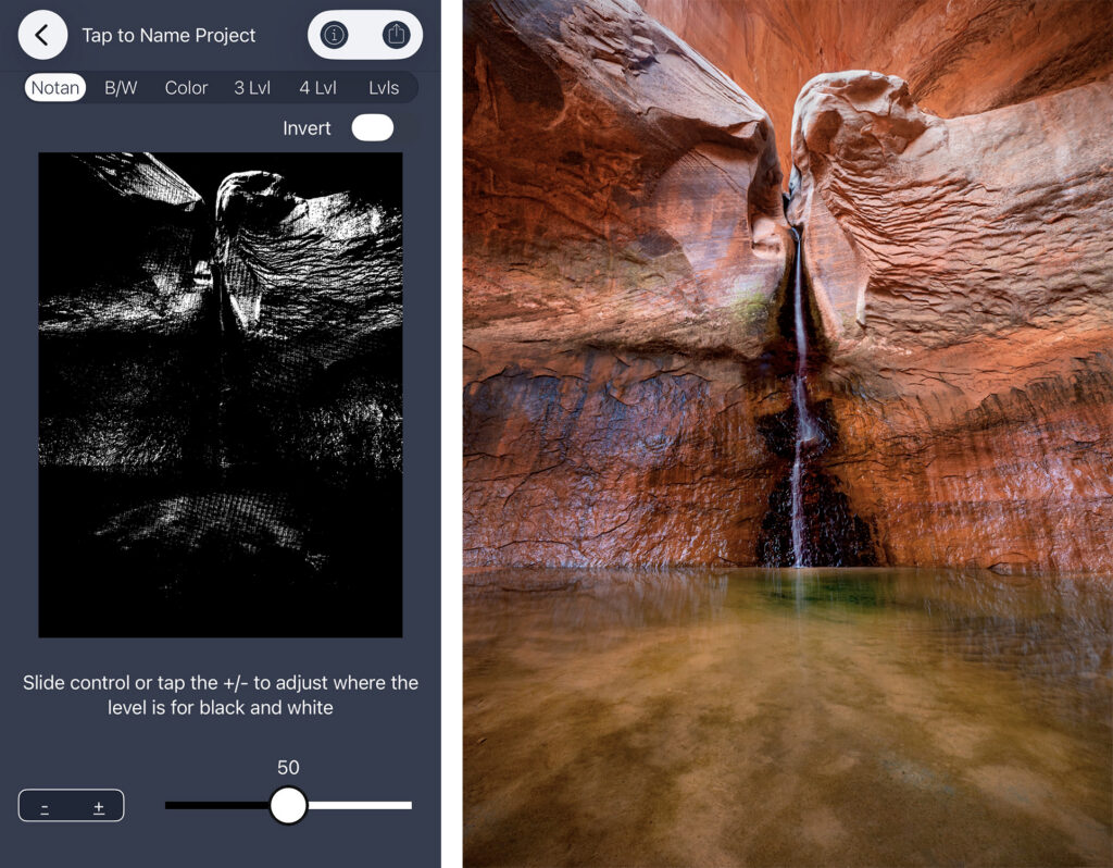
I started paying closer attention to light in the field as I was composing. I started doing what I call a “tone check” where I switched my Picture Style/Control to Monochrome in my camera. This enables the camera to display the JPG rendition you see on your LCD (even if you’re photographing in RAW) in greyscale. It stripped out the color “noise” and allowed me to better see the relationship between tones as I was creating my image.
I also sometimes whip out my iPhone and notanizer the photo on the LCD screen. From there, I make choices: Do I need to shift my perspective or position? Do I need to zoom in or out? Do I need to look for different lighting scenarios? Or do I do absolutely nothing in the field and address the tone balance through burning and dodging in processing software later? Is my image perfectly balanced already, and I don’t need to do anything at all (other than eat pie to celebrate)?
The latter doesn’t happen terrifically often (the pie part does, though…), mainly because I’m aiming to create an experience within my photograph to match specific meaning or emotions. I’m not aiming to recreate exactly what I saw in the field. There’s a difference…Mother Nature is remarkable but sometimes I wish to express something completely divergent from the conditions.
Then in processing software, I conduct another “tone check” where I add a black and white layer on top of my image and sample the individual tone values using the eyedropper. This gives me very specific data and direction as to where I want to lighten and darken places within my image (i.e., burn and dodge using a combination of masks, selections, brushes, and exposure adjustments).
Then I’ll use the Notanizer app to check my progress. If the composition isn’t holding up the way I’d like after I “notanize” it, it doesn’t mean the photograph is trash. It means I just have more work to do (e.g., burning and dodging) in creating a more unified arrangement. If I like what I see on the notan, I know my work is done.
As an aside, before I knew about notan and before we had all this fancy technology, back in the good ole days of film, I used to simply squint when looking at a scene. It helped me see shapes and structure without all the chaotic details in a landscape. Ahhh those were the days…
For an additional explanation of how considering notan informs composition in paintings, check out “Notan–Exploring Shape and Color” by painter Mitchell Albala at https://youtu.be/7AS9zvjwmUM.
Should you wish to integrate notan into your compositional approach for your art—and I’d encourage you to do so!—here’s your homework:
- Read Dow’s book.
- Read Bothwell and Mayfield’s book.
- Download the notanizer app.
- “Notanize” one of your photographs. What do you observe? What changes could you make to improve the relationship between lights and darks?
- “Notanize” one of O’Keeffe’s paintings and Ansel’s photographs to study their notan results.
- Extra credit: Want to improve your composition and attention to detail? Paint! We photogs can sure learn a lot about visual design and composition from painting…combinatory play! Feed your brain knowledge and ideas!
Notan is an excellent visual aid to help us understand what’s happening within our frame and assist us in making choices about our arrangements. As I’ve practiced notan (which means noticing and simplifying), my compositions have become more effective in communicating my visual expressions. And that’s the name of our game: being consistent and confident when sharing our vision.
Happy notanizing! Happy creating!
Be well, be brave, be wild!
~Bubbles
Have a question about photography, art, and/or the creative life? Looking for advice or inspiration? Send your question to Dear Bubbles at colleen@colleenminiuk.com to be possibly featured in a future column post. (If you’d prefer a different display name than your real first name, please include your preferred nickname in your note.
Thanks to the generous support of many, the Dear Bubbles monthly column will remain free for all to read. If you’ve gained inspiration, education, or even just a laugh out of this and the other Dear Bubbles posts, please consider chipping in a small donation. For as little as $2/month (less than a cup of coffee!) as a Dear Bubbles Patreon supporter, you’ll gain access to the Making the Photo video series, the forthcoming “Bubble Wraps” image reviews, and other special perks. Your generosity at any level keeps this site ad-free and focused on learning which is hug-worthy and greatly appreciated!


2 Comments
Chris Starbuck
Tip: if you’re right about what Notanizer is doing, the same thing can be done in Photoshop with a Threshold adjustment layer. Leave it at the top of the layer stack and make it visible when you want to check your progress and hidden while you’re working.
Bubbles
Whoa! What a great tip, Chris! YES! I just tried your Threshold trick with several of my images, compared it to the Notanizer app, and it matched almost exactly. I’m now even more convinced that’s exactly what the Notanizer app is doing. So save yourself $2 if you have Photoshop! Thanks much for chiming in!