On Breaking the Rules

Dear Bubbles:
I keep hearing once I know the rules, I should break them. I don’t get this. How do I know which rules to break and when to break them? I just want to make a good picture! Help!
Debbie
Dear Debbie,
There are three statements we hear frequently in photography that drive me bonkers:
- What are your settings? Read more of my thoughts on this at “Setting Yourself Up for Success:” https://dearbubbles.com/2019/11/setting-yourself-up-for-success/)
- Slow down. Instructors suggest this frequently to get students to pay attention more to their surroundings, to soak it all, to connect with the landscape first before blasting away with a camera. This makes sense, and everyone, including me, could pay attention more. But I’m not a slow person! (A surprise to absolutely no one who knows me.) Telling me to slow down goes against every gain of my being. I can—and do—pay attention fast.
- Once you know the rules, break the rules.
I’m not sure which one makes me crazier. Seeing the three of them on the screen together makes me want to call my therapist. I may need a second to recover…someone cue the bubbles, quick!
Anyhow! My first introduction to the idea of composition came with a laundry list of line items I supposedly needed to keep I mind while arranging the elements within the frame. Things like (and this is not an exhaustive list):
- Follow the Rule of thirds. You’ll spontaneously combust if center your subject and don’t position the horizon through mid of the frame.
- Keep your horizon straight horizon.
- Avoid front lighting.
- Shoot only at sunrise and sunset (“because that’s when the ‘best’ light is…”).
- Find a primary subject and full your frame with it.
- For a landscape photograph, keep everything in the frame in focus.
- Find subjects in odd numbers. Evens numbers are evil.
- Make sure everything in the frame is “properly” exposed.
How was I supposed to remember all of this while standing in front of a mind-blowing scene in fleeting light with a camera I did not yet know how to use? Sound like a recipe for frustration? It was. But it was worse than that…
I’d often set up what I felt was a semi-decent composition, then realize I had forgotten to follow one of the rules. I’d look around for a stick to put in the foreground. Alternatively, I’d pick my camera and tripod up and move it so that the nearest bush fell into the bottom intersection points of the Rule of Thirds. And BOOM! Rule followed! Then I’d see the resulting images, usually a week or more later since I used slide film at the time. I routinely felt disappointed. Sure, following the rules yielded technically perfect photographs. None of them came close to depicting how I felt standing in front of some majestic and awe-inspiring scene. In hindsight, thing only thing me putting a stick in the foreground conveyed was that I was capable of putting a stick in the foreground and checking a box. Yay.
I initially thought, “Maybe I just wasn’t standing in front of something pretty enough.” (For that discussion, please read “Stand in Front of More Interesting Stuff”: https://dearbubbles.com/2021/05/stand-in-front-of-more-interesting-stuff/). Maybe I wasn’t implementing the Rule of Thirds well enough? (As if that was possible…) Then someone suggested I should break the rules.
Ooooooohhhhhh….you can do that?? I thought. Breaking the rules sounded so rebellious to a girl who was taught by nuns in Catholic school (but only in 1st and 2nd grades). But how was I supposed to break the rules? Do the opposite of what I’m told? Ignore the rule completely? Someone giving me permission to deviate from the checklist I had learned thus far didn’t provide any additional clarity. It made me even more lost. Truth be told, I still don’t know what is meant by the statement.
I mean, I was capable of putting just about anything in the center of the frame. I could make my images blurry—sometimes even on purpose! Once in a while, I’d snap the shutter at high noon. But when I did these things, nothing seemed to turn out right. If I had no comprehension of why I was following the rules in the first place, I certainly had no idea how to effectively not follow them.
Rules tell us what to do, but fail to explain why we should do whatever it is they are telling us to do. In hindsight, they were a quick-and-easy way to get to a seemingly right answer, albeit a boring one. They were merely shortcuts to embracing a deeper understanding. As scholar and historian Charles Issawi said, “A shortcut is the longest way between two points.”
So then what do we do? To get beyond this, I turned into a curious five-year old asking “Why? Why? Why? Why? Why?”
Why should I put my primary subject in the intersection points of the Rule of Thirds grid?
Why should I have a primary subject?
Why can’t I put something in the middle of the frame?
Why can’t I split my frame down the middle with a horizon line?
Why does putting a stick in the foreground make the image a better image? Or not?
If the rule came with some explanation—like shoot at sunrise and sunset because that’s when the “best” light is—I questioned why that light was deemed the “best” by The Great and Almighty Gods of Photography (the internet). Why might I spontaneously combust for centering my subject? Why are an even number of similar subjects “evil”? So much judgment needed to be unpacked.
In my quest for answers, I came upon three insightful titles:
- Art and Visual Perception by Rudolph Arnhem
- Perception of Images by Richard Zakia.
- Picture This: How Pictures Work by Molly Bang (Tell me that Little Red Riding Hood has never been so visually interesting!).
All three introduced me to Gestalt psychology and human perceptions in different ways—all useful to me and how I approach my compositions still to this day. The Merriam-Webster Dictionary defines “gestalt” as “Something that is made of many parts and yet is somehow more than or different than the combination of its parts.” It describes “perception” as an “awareness of the elements of environment through physical sensation.” If we understand how people interpret their surroundings—and we do to an extent through science research and intuition—we can organize the chaos we experience “out there” into our rectangular frame
(Note the definition of perception goes beyond “seeing.” While you’ve likely heard that photography is the art of “seeing,” creative expression involves all of your senses, not just seeing. I’d argue, creative photography is really the art of sensing and experiencing.)
The descriptions of gestalt involve things like the Law of Proximity and the Law of Closure. Sounds a lot like rules, right? In this case, a rule feels more like a required course of action and a law explains a common practice. The gestalt principles are based in what you already inherently know as a perceiving human being yourself. They rely on your own instincts. Rules don’t.
The second you decide to use photography as a means of creative expression, and not as a way to create technically perfect images of pretty scenes, I encourage you to ditch the idea of “following the rules and breaking them” as soon as possible. Once you understand the technical aspects of photography and how to translate these into functions on your camera, turn your focus to becoming competent and confident in conveying what you deem meaningful in your experience in the world through your camera by tapping into Gestalt psychology and human perceptions. More specifically:
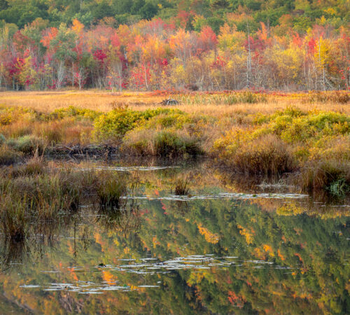
Veer away from identifying a “primary subject” to defining relationships among “visual elements”: While you might select various compositional tools to highlight a specific part of the image, the truth of the matter is a photograph includes—and our viewers see—much more than a single dominant subject. Anything included in the frame will have implied relationships. Rather than leaving this to chance (ala the “spray-and-pray method), consider these relationships as you developing your visual message and make compositional choices well before you snap the shutter. To help me do this, I don’t see trees, rocks, or part of a lake. I see shapes—visual elements I can “play” with in my arrangement. I see trees as triangles, rocks as circles, and a part of a lake as a rectangle. I then see relationships between triangles, circles, and rectangles. In general (so long as the elements aren’t moving too fast), I have the power to adjust their relationship with each other. I can move to the left or right to make them overlap in my two-dimensional photograph even if they are physically far apart. I can move closer to an object to make it appear larger in my frame even if it is smaller than the objects in the distance. I can change lenses from wide-angle to telephoto to compress them. While I started using this approach while using a 4×5 large format camera—which showed your image backwards and upside-down, effectively stripping any semblance of reality—relationships between things are something we inherently understand. When two people are walking down opposite side of the street, what kind of relationship do you think they have? If they’re standing next to each other, holding hands, in the middle of the street, now what kind of relationship do they have? It’s the same for trees, rocks, and lakes—and all the other visual elements we have out there to work with.
Pay attention to how you perceive the world without a camera in hand: How does looking at a fire make you feel? How do you respond differently to things that have sharp, jagged edges from those with sort, rounded edges? What happens to big, heavy things when you drop them?
Many people would say they feel warm when looking at a fire. We associate flames with reds, oranges, and yellows (and maybe even hints of blues). So when we see reds, oranges, and yellows in a photograph, even if no fire exists in the frame, our brains make an association with fire which associates with feelings of warmth. If we wanted to make people feel warm after looking at our photograph, we would intentionally increase our emphasis on reds, oranges, and yellows.
Same thing with the characteristics of shapes. Sharp, jagged edges on objects like knives tend to cut, tear, shred. They can feel a little scary. Soft, circular objects like throw pillows tend to feel inviting and comforting. If you were making a photograph of something jagged in nature, let’s say a rugged edge of a cliff, viewers will likely feel a little uncomfortable (subconsciously or consciously depending on their previous history with cliffs). That may be exactly what you wish. If it’s not—let’s say you wanted to make the scene more inviting—you’d intentionally eliminate the rugged edges and emphasize parts of the landscape that had smoother transitions.
Finally, big, heavy things drop quickly to the ground because of gravity. When big, heavy objects are at the bottom of a photograph, they feel at rest. They have already fallen. Small, light things float before resting on the ground. When small, light things appear at the top of a photograph, they feel airy, as if they are floating. When we see the opposite of both of these scenarios, we create visual tension and energy because they are anomalies to what we understand of gravity. They’re behaving differently so viewers pay attention to them more.
Learn the components of visual language: I’ve just provided three examples of how to translate what you already know of the world into a photograph. There’s so much more involved than I can ever write in a single blog post. To get more formal artistic and photographic instruction on this, read the Arnheim, Zakia, and Bang books. Listen to my free 90-minute presentation about Human Perceptions in Composition at https://youtu.be/3mDYFq2J5EM. Through these additional resources, you’ll gain insights on three important components:
- How positioning visual elements within different parts of the frame affects how we perceive energy, force, movement, gravity, and proximity.
- Creating depth in a two-dimensional media by creating illusions among relationships between lines, shapes, layers, and light.
- The cultural associations of individual colors.
Use verbal language to connect with visual language. If you struggle, as I often do, jumping from “I’m having a moment here in this place and time and I think I want to make a photograph” to executing a composition you’re proud of, I recommend talking it out with yourself. We were all taught how to verbally express ourselves. Only some of us were taught how to visually express ourselves through art classes. (I am not one of them.)
Sometimes I just start talking to myself, answering the questions, “What am I responding to and why? What does this moment mean to me? What do I wish to convey with viewers?” Sometimes I title my photographs before I snap the shutter. Sometimes I write a haiku. I always pay attention to the words coming out of my mouth or from my pencil. For example, if I notice words like “peaceful” or “harmony,” those are my cues to center my subject, use symmetrical balance, arrange my frame horizontally vs. vertically, and to avoid including reds, oranges, and yellows in my frame (and look for peaceful and harmonious balance of greens and blues). Many right answers exist. Picking the “right” one for you and your image depends on you defining ahead of time what you wish to wish to convey in your photograph (a step in the visualization process). Then select the appropriate visual language components to deliver that message and meaning.
Question everything in your frame. Become a five-year old! Ask “Why? Why? Why?” Why are you doing what you’re doing? Why have you included “that” visual element and what is each one doing in your photograph? What meaning is it conveying? Is that what you want? In other words, why are you centering the kelp? What is that vertical line doing for you in your frame and does it support your intent? As Molly Bang wrote in her book, “Do not worry whether the picture is pretty. Worry about whether it is effective…” It may benefit you to slow down. GAH!!! Yes, I just said that! It’s only temporary. As your intuitions come to the forefront of your process, it’ll become second nature over time.
I have found through the years that photography as became more much fun and rewarding once I shifted away from trying to check all the boxes on a checklist of rules to applying Gestalt psychology and human perceptions. More importantly, it led me to creating images that I was proud of, images I called “good,” images that meant something to me. I’d wish the same for you, Debbie, and for all the photographers out there stuck following the rules.
Be well, be wild,
~Bubbles
Have a question about photography, art, and/or the creative life? Need some advice? Looking for inspiration? Send your question to Dear Bubbles at colleen@colleenminiuk.com to be possibly featured in a future column post. (If you’d prefer a different display name than your real first name, please include your preferred nickname in your note.