Putting Your Eye in ICM
Dear Bubbles:
Is there a point where ICM doesn’t work? Sometimes I get a picture that looks OK but sometimes I get one that hurts my eyes to look at. Am I doing something wrong?
IDK (I Don’t Know)
Dear IDK:
Intentional camera movement (ICM) is a photographic technique where a photographer deliberately moves their camera during an exposure. There are many different approaches to this. You can pan from side to side horizontally, pan from top to bottom vertically, do a zoom pull with your lens, or shake-shake-shake your camera in any direction you wish.
The point of doing a little dance with your camera sans-tripod is to create an abstract rendition of a scene, to get an increased sense of motion such that the motion itself becomes the main subject. In doing so, a photographer can express an interpretation of the scene that conveys a deeper meaning beyond a literal, more realistic depiction. These purposeful, yet somewhat random, movements can take a straight scene and turn it into a celebration of abstract lines, shapes, colors, and layers.
(For a refresher on what intentional camera movement is and some basic tips on how to do it, head over to my Movin’ and Shakin’ column.)
This concept is not new or exclusive to photography. ICM has ties to Impressionism. According to the The Met, “Claude Monet’s Impression, Sunrise (Musée Marmottan Monet, Paris) exhibited in 1874, gave the Impressionist movement its name when the critic Louis Leroy accused it of being a sketch or “impression,” not a finished painting.”
Instead of brush strokes, photographers use camera strokes to get that impressionistic vibe. But how do we know when we’ve done our impression right? How do we know we have a finished photograph when it looks out of focus?
ICM images could fall under its own Goldilocks principle. The key is to convey enough movement so that it doesn’t look like your frame is out of focus, and thus, uncomfortable to look at, but not so much that it’s so blurry you can’t tell what it is. What’s just right? There is a lot of space for interpretation between those points. That decision is up to the artist. As author Margaret Wolff Hungerford wrote, “Beauty is in the eye of the beholder.”
In straight still photography (i.e. not ICM renditions), generally speaking, we aim for something within the composition to be in focus. That’s because the human eye has a difficult time focusing on things that are out of focus. So much so that we tend to avoid them.
Landscape photographers typically want their entire frame, from foreground to background, to appear sharp. This requires managing the hyperfocal distance and the depth of field through modifying our aperture settings, lens choice, and subject-to-camera distance. This allows the viewer to explore the entire frame with ease.
Sometimes photographers, especially ones photographing smaller scenes with a macro or telephoto lens, use a limited, or selective, depth of field to blur parts of their frame on purpose. Set a wide aperture like f/2.8 or f/4 and select one part of the frame on which to focus, leaving the rest of the composition out of focus. The viewer will skip over the out of focus parts to focus (literally) on the in-focus parts. This is an effective way to direct a viewer to the most important part of your visual message. It also creates the illusion of depth in our two-dimensional media by separating the scene into multiple layers. When done with intention and for good reason, the balance between sharp and blur aids the viewing experience.
Now, even if you’ve spent only a little time in photography, everyone has made a completely blurry image before (or maybe two or two thousand). Blurry images can result from things like a photographer hand-holding a camera at too slow of a shutter speed, bumping their tripod, improperly placing their focus point, or using image stabilization or vibration reduction when photographing from a tripod. Sometimes it’s not our fault! A gust of wind or a crashing wave can make it harder to keep everything in focus even when we’re doing everything else right. These forms of unintentional camera movement are not always easy to look at. These are the ones that end up in my pixel pile o’trash.
With ICM, little to nothing within the frame appears sharp or in focus—on purpose. What makes a successful ICM to me is one that blends all the concepts that makes a straight still photograph great while blurring the subject. In other words, the ICM image needs to have enough structure even in the absence of structure.
No matter the technique we employ, we still need to retain depth in the our two-dimensional media. We still need to separate figure from ground. We can do this through the three L’s: lines, layers, and light. You may recall from my earlier column Entering the Third Dimension that the camera does not see objects the way the human eye does. It only collects reflected light. In order for your photograph to depict a line, the camera needs to collect a contrast in light—a highlight and shadow working together. Multiple lines working together within a frame create shapes. Multiple shapes working together create layers. Layers are separated from each other through differing tones. In other words, light. So, the three L’s work together—and none of these elements need to be in sharp focus to create the necessary structure. The eye—yours and the viewers—just need something to grab on to.
Success starts with identifying scenes, as you would with a landscape, macro, or any other type of photography, with appropriate tonal and color contrasts. Side light and back light will provide natural separation between highlights and shadows. But cloudy days and completely shadowed areas can also work well so long as you’re observing separation between dark tones and light tones.
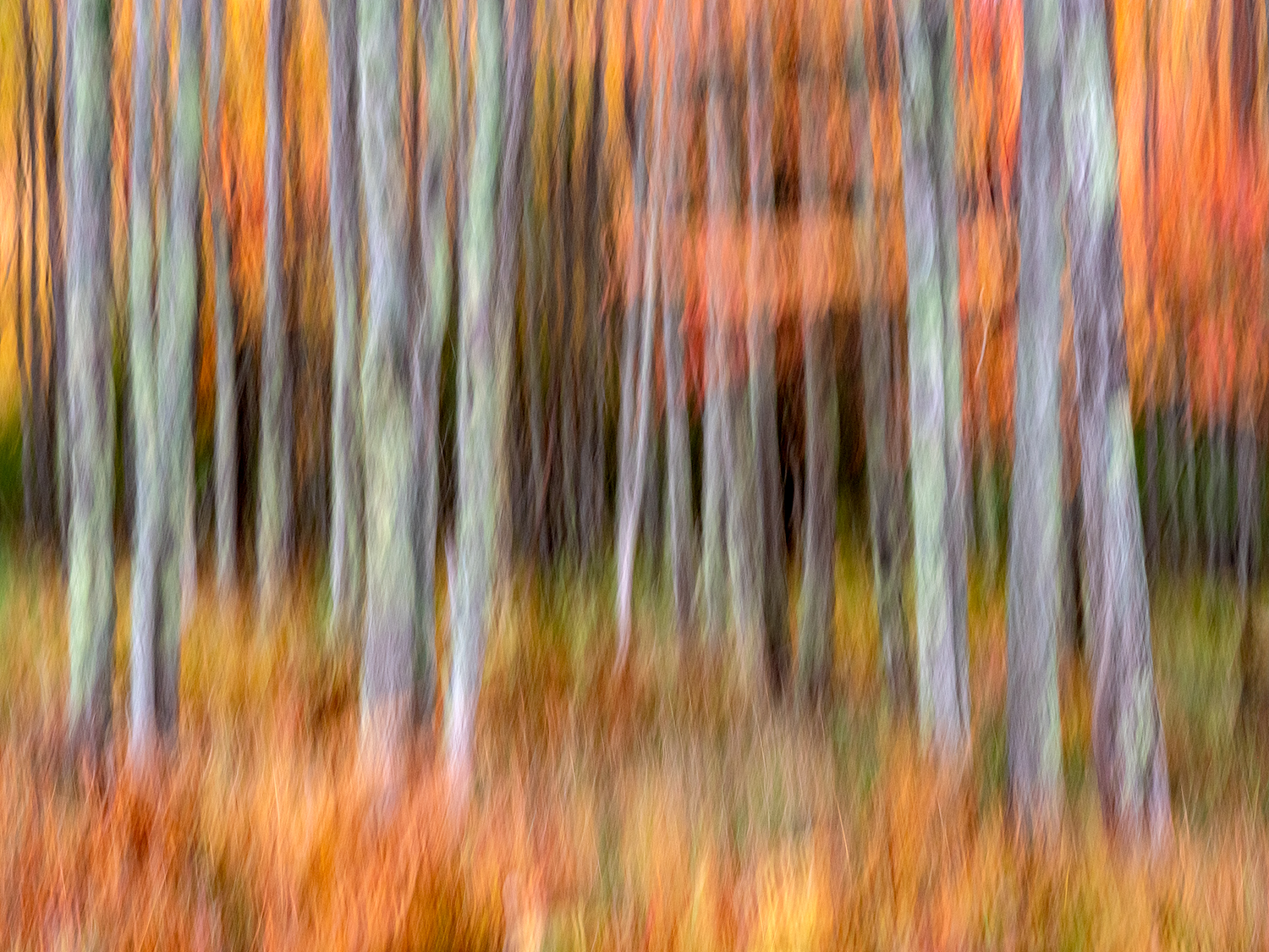
The photograph at the top of this post was made in overcast conditions. The lighter trees in the foreground stand out from the darker trees and shadows in the background. The color of the bright orange leaves in the trees and ferns contrast with the more subdued tree trunks. You may need to move around and change your perspective to get shapes and visual elements to align to your liking, but just paying attention to how the light falls across the scene will help create layers in an ICM photograph.
Where the lines get blurred (literally and figuratively speaking) is in the variations between your shutter speed and your physical movements during the exposure.
(The other variable in this formula, which is usually out of our control, is how fast the subject is moving. For example, how fast are the leaves blowing in the wind? Sometimes the wind can do some of your work for you in creating movement with keeping the camera relatively still with just about any shutter speed.)
I have found, through much experimentation (i.e. screwing up and making a lot of bad images) that I can preserve good structure and depth with a shutter speed somewhere in the range of 1/20th and 0.5 sec for my ICMs. The faster the shutter, the faster your physical movements need to be to keep the image blurred enough so it doesn’t look like an accident. You have more flexibility in the speed of your movements with a slower shutter speed. But you also risk making the image so indistinct, it becomes one big blurry blob of color.

Which isn’t necessarily bad! I’ll do this on purpose to make backgrounds to use with multiple exposures. Plus, plenty of painters work in monochrome (https://magazine.artland.com/the-monochrome-a-history-of-simplicity-in-painting/). Some have even sold their one-color paintings for millions of dollars (https://www.barrons.com/articles/a-1960-yves-klein-paintingcould-fetch-more-than-us-30-million-at-debut-auction-01653596738).
To each their own! In art. In photography. And in ICM. (And in pie flavors, by the way.)
There is no universal definition of the right or wrong way. What’s right for one isn’t for another. Putting the “I” in ICM means you have to put your eye in ICM. You’ll want to train your brain and develop your tastes for how YOU wish to incorporate this technique.
To do this, I’d recommend two activities:
First, conduct critiques on your ICM images, on other photographers ICM images, and on impressionistic paintings. Study a lot of art. What do you like about what you see? When you see an image you like, how did the photographer use lines, layers, and light to keep the structure? What don’t you like about what you see? How could using lines, layers, and light in a different way helped convey more structure? What guesses can you make about the artist’s processes? How that process affected the artist’s results? Did they use a short or long shutter speed? Did they use quick, abrupt physical movements or slow, fluid ones (i.e., how short or long are the lines)? In which direction did they move the camera? (You can usually delineate this by studying the lines once again.) What things might you try in your own work?
Second, go try them! Experiment to develop your own ideas and style. See what happens when you use:
- Short shutter speeds (around 1/30th of a second) with quick movements
- Short shutter speeds (around 1/30th of a second) with slow movements
- Moderately fast shutter speeds (around 1/8th of a second) with quick movements
- Moderately fast shutter speeds (around 1/8th of a second) with quick movements
- Long shutter speeds (around one second) with quick movements
- Long shutter speeds (around one second) with slow movements
Repeat the sequence above while moving the camera:
- From top to bottom
- From bottom to top
- Up then down
- Down then up
- From side to side
- In a circle
- Diagonally
- In the form of any letter in the alphabet
- With a shake-shake-shake
- With a zoom pull
- Any random movement you can imagine
The combinations are endless! You can do this at home! You can treat yourself to pie and bubbly afterward for your efforts!
As you practice, keep in mind that, while you may move the camera deliberately, your results may not be consistent from frame to frame. Even if you keep the shutter speed the same, your physical movement might vary. So then will your results. That’s not only OK but also expected. Don’t get frustrated with the randomness of an intentional act.
Part of the fun with ICM is, even if you act with purpose, you don’t always know what you’re going to get. Not every frame will work out. You might make 200 frames to get one you like. We don’t track batting averages in photography. If you get something you like, hang it on the wall! If you get something you don’t like, trash it. Remember, they put the Delete button on the back of the camera for a reason.
Eye can’t wait to see what you all come up with!
Be well, be wild,
Bubbles
If you liked this post and others like it, please consider supporting Dear Bubbles either through a monthly contribution through Patreon or a one-time donation through Buy Me a Coffee. Learn more about both at https://dearbubbles.com/support.
Have a question about photography, art, and/or the creative life? Need some advice? Looking for inspiration? Send your question to Dear Bubbles at colleen@colleenminiuk.com to be possibly featured in a future column post. (If you’d prefer a different display name than your real first name, please include your preferred nickname in your note.

Searching for "The One"