Entering the Third Dimension

Dear Bubbles:
Even though I’ve been in classes of all sorts, and I’ve been taught the things, I’m still not getting the great depth in my images that I see in yours. I know about foreground, midground, and background, but help me with getting it all sharp. Sincerely,
-Stuck in the Shallows
Dear Stuck in the Shallows,
It sounds like you have two things going on from your question:
- How to create a sense of depth in your photograph, and
- Once you do, how to keep everything in the photograph sharp.
They do work together, but let’s first sort these out one at a time…
I remember after first hearing about composition years and years ago (like when the dinosaurs roamed the Earth), specifically how every image should have a distinct foreground, midground, and background, how I’d set up my composition then run around looking for a stick or a rock to put in the foreground. Boom! Box checked!
And then the image I’d make would look so stupid. Sure, I created a sense of depth by adding something close to the camera—just like I had been told!—but it looked so disconnected from the rest of the image. It looked forced. My images still fell flat.
After learning the basics with 35mm and medium format film cameras, I started photographing with a 4×5 large format camera. When the image appeared on the ground glass—the equivalent of our digital LCD and “live view” mode today—everything looked upside down and backwards. It was sometimes hard to make out what you were actually looking at. Instead of seeing “trees” or “rocks,” I started to see shapes: rectangles, triangles, circles, squares, and more.
More importantly, I started to see how these shapes related to each other and make decisions accordingly. Did I want that triangle to overlap with that circle? Did I want that square to be bigger or smaller than that square over there? If I include a bunch of small circles (i.e. a repeating pattern), will I make that hexagon look bigger or smaller? What happens if I exclude three of those circles instead?
There was so much more to the frame than just identifying and isolating a primary subject or balancing a foreground versus background—two things we often hear in those classes or read in those books about composition. Everything in the frame mattered, and everything had to be dealt with! To not only create a composition someone other than me would find pleasing but also to recreate the same feeling of depth I experienced in the field in a two-dimensional photograph.
So my first piece of direct advice is to look at the world you see in shapes, not as objects with labels like “tree” or “rock.” To practice this, print out one or two of your own images and draw the various shapes you find in your frames. Evaluate how the shapes interact with each other. Do the shapes feel balanced? How might you change your position (in the field) to create more effective relationships among them?
See, your camera does not care one iota about objects or the labels we give to such things. It only “sees” and records reflected light from these things.
Light, specifically a contrast between a highlight and a shadow (or conversely, a bright area and dark area), creates the illusion of a line in a photograph. Lines are everywhere “out there,” not just in the obvious ones we notice like a fence, boardwalk, or horizon. Two or more lines that converge within your frame create a “vanishing point.” Gestalt psychology research tells us that humans—e.g. the viewers of your images—will perceive the point at which those lines touch (“vanish” from view) to feel farther away.
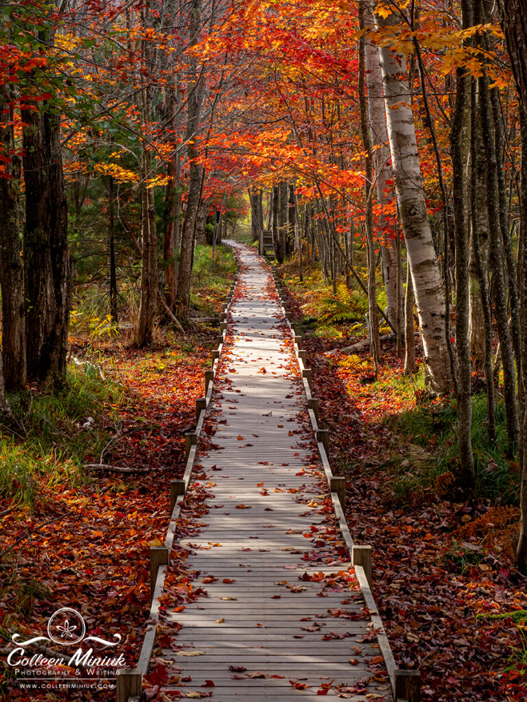
Multiple lines working together create shapes. So in the photograph on the right of the boardwalk, we not only see a vanishing point, but also a narrow triangle created by the two lines and the edge of the frame. Two additional triangles exist, one on either side of the bright path. The three of them work together to create symmetrical balance.

Interestingly enough, the absence of lines also creates shapes. Most people will see a white triangle (surrounded by three black Pacman’s!) in the graphic on the right. They will also perceive a second triangle, outlined with a black line, behind it.
Sometimes our brains and eyes deceive us. What we think we see and what we actually see doesn’t always line up. No triangles actually exist in this illusion which is called the “illusory contour.” An illusory contour is defined by Wikipedia as “visual illusions that evoke the perception of an edge without a luminance or color change across that edge”
If someone has ever told you your image feels like it has movement, you likely have at least the start of an imaginary shape. Movement between three or more visual elements creates invisible lines, ones our viewer’s eye follows. These three or more lines create an invisible shape. Anytime I perceive the presence of an illusory contour, I darken around those three (or more) points. I basically create the three subtle Pacman’s around them using masking (or alternatively burning and dodging) in processing software.
If you don’t want to work so hard to create a separate, but invisible, layer, you could also add a dark vignette around the edge of your frame. Confession time: 95% of my images have a vignette on them for this very reason. It creates the illusion of a separate layer (by separating the light/tonality) which creates the illusion of depth.
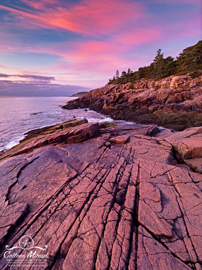
As we saw with the illusory contour, shapes that overlap create a sense of distance—one triangle appeared to be in front of another. Technically, not only do the triangles not exist, but they also aren’t layered on top of each other either. Gestalt psychology calls this overlap “interposition.” Visual elements that appear partially obscured—the triangle with the black outline—to feel farther away than ones that appear whole and unobscured. In photography speak, visual objects that are partially obscured will feel more distant in the frame than ones that aren’t (as in the photograph at the top of this post.)
Sometimes the overlap works to create a sense of depth. Other times, visual elements that are most certainly separate in our reality when we look at a landscape scene tend to appear as if they merge in the photograph. A sunburst “touching” the horizon in a photograph is a merger. The sun does not actually touch the horizon (and if it does, we’re in a world of hurt…) So is a tree coming out of someone’s head. In these cases when the overlap distracts, move to the right or to the left, or adjust your tripod higher or lower, to resolve or make less obvious.
As you move around, you’ll want to consider the relative size of the visual elements visible in your frame as it enables our viewers to distinguish distances. According to Gestalt psychology, large objects (especially dark ones) look closer to our view than small objects. To incorporate this visual illusion in my frame to convey a sense of depth, I leverage the distortion in my wide-angle lens and use a “forced perspective.” It’s a cousin to the “near-far technique,” as in everything from near to far in the photographic frame is in focus.
With landscape scenes, I position my camera close to whatever I’ve defined needs to be in the foreground. How close? Within a foot, maybe inches. Close. Then I tilt the camera down. This makes the visual element closest to my lens look much larger than it actually is, especially when compared to the expansive midground and background.
Based on my experiences in workshops and working with a lot of photographers, what prevents us from getting close is our fear of depth of field. In other words, getting so close, keeping everything sharp becomes a challenge. Get close and be fearless!
Conquer your fear by consulting a depth of field app to determine the hyperfocal distance. The hyperfocal distance is the point at which you must focus at such that half of that distance to infinity is in focus. It’s a calculated number based on your camera (and sensor’s circle of confusion), focal length of your lens, and aperture. It can help you define where to place your focus point and what aperture to use to ensure your entire frame is in focus.
(I move to rename the hyperfocal point as HF, or “The You-Have-to-Focus-Here” distance?” Do I have a second from the congregation on the motion on the table? I’m putting this to a vote on this someday…)
For an in-depth review of depth of field, visit my previous post called “Another Dose of Depth of Field”: https://dearbubbles.com/2020/04/another-dose-of-depth-of-field/
If you aren’t able to achieve the focus you’re looking for, you could tap into focus stacking instead. Focus stacking is an approach where you make a series of exposures at different focus points (keep your aperture consistent) then blend the multiple frames together in processing software (or in camera if it’s capable).
Since we’re on the topic of keeping things in focus, let’s pause our conversation on depth for a minute, and review some additional ways to ensure your record a sharp image:
- When photographing small scenes, try to keep the lens parallel to the subject’s plane (use your hand to measure, if needed) to maximize the minimal depth of field, even at small apertures like f/16 and f/22.
- Turn your image stabilization/vibration reduction off when photographing from a tripod. If you keep it on, the camera may think it needs to stabilize “something” and will make slight shaking movements—enough to make your image blurry.
- If you photograph from a tripod, do not hold onto your tripod during the exposure. Your heartbeat alone will cause camera shake.
- Use a cable-release (officially called a “clicker-doo” by Bubbles) or a wireless remote to trigger the shutter versus using your fingers, especially with shutter speeds slower than 1/10th of a second.
- Use the Depth-of-Field (DOF) preview button, if available, to visualize the sharpness across your frame before you shoot. Some new cameras have a focus alert built into the manual focus function. For example, my Olympus OMD EM1 Mark II sparkles yellow at me when the elements are in focus.
- Zoom in on photo after you shoot. Move the autofocus point or the manual focus point around until you see the sharpness you hope for. Then reshoot. Rinse. Lather. Repeat.
The funny thing is, keeping everything in the frame, if you’re not employing other visual cues for depth, can actually make your image look more flat. Having out-of-focus areas surrounding in-focus areas creates a layering effect: the sharpness of visual elements creates a separation between them.
To apply selective focus, use a wide aperture (an f/5.6 or wider) and focus on your dominant visual element. Let the rest of the image blur—including the foreground and background. Accentuate the soft and out-of-focus effect by using a longer lens (e.g. telephoto or macro) and by positioning yourself as close to your foreground (i.e. almost touching it with your camera lens).
Back to depth! The last piece of this dimension puzzle is light. As we saw earlier with the illusory contour and vignette, layers are further separated by variances in tonality.
The easiest way to create the illusion of depth is to pay attention to how your camera “sees” light AND shadows (not just light…). Without this contrast, we produce even illumination. Even illumination means even tonality. Even tonality means a flat image. Boo!
Side and back light render this contrast, particularly in direct lighting conditions (i.e. direct sun light). Front and top light do as well, but the shadows are not visible to the camera because of our perspective. Moving your camera’s position to the left or right might turn front light into side or back light. With bigger landscape scenes, though, you might have to walk quite a distance to do so. It might be easier to return at a different time of day or day or season to find this shaping light. Consult The Photographer’s Ephemeris to visual light in your desired location to determine what would work best.
Whether we’re dealing with direct sunlight or a cloudy day, pay attention to the natural tonal separations between lights and darks. No matter the weather, if I want to see how flat my image looks, I conduct a “tone check” in the field. I change my Picture Style to Monochrome. This renders display a black-and-white version of my image in playback mode. Since I photograph in RAW format, the camera retains ALL the data, including data regarding color. So you aren’t creating a black-and-white file when you do this.
(If you’re photographing in JPEG, you are creating a black-and-white photograph with this setting. If you do not wish to do this, remember to reset your Picture Style into a color setting before you shoot.)
When I do a tone check, I’m analyzing where the tones run together—where they look the same and no contrast exists. And it becomes very obvious quickly where the image needs help. I then either choose to recompose and/or define the necessary adjustments I’ll do in processing later on the computer. Where will I lighten and darken to create a stronger sense of depth (and direct the viewer’s attention)?
Even if you don’t do the tone check in the field, you can do it at the computer in processing software by converting the image to black and white. Once again, this makes it very obvious where the problem areas are and where I need to burn, dodge, and/or mask to create stronger tonal separation. (Those of you who have been on one of my photography workshops or in one of my presentations may have heard me refer to this approach as “painting in light” or “painting in tones.”)
How do we know what parts of the image to lighten versus darken? Lighter areas feel farther away in a frame, but will grab a viewer’s attention more quickly than a dark tone. If I want something to grab attention but feel more distant, I’ll lighten it. On the flip side, darker areas feel closer to our view, but will recede into the background of attention. I darken areas I don’t want you to see and feel closer to your view (like the edge of a frame = vignette!).
When we have contrasts, we create lines—and now we’re right back to the beginning. In other words, incorporating the three L’s—lines, layers, and light—can help create the illusion of depth where no physical depth actually exists. In addition, if we understand how our brain and eyes play tricks on us (and our viewers), we can incorporate subtle visual clues that make our viewers feel the same type of depth we experienced with our own eyes in the field. We can make them feel like they are in the scene, not just a distant observer.
But first! You have to be in your scene—be mindful of how you’re arranging the lines, shapes, layers, and light in your image as you approach your landscapes, and you’ll literally add a whole new dimension to your photographic work.
Be well, be wild,
~Bubbles