Common Mistakes with Landscape Photographs

Dear Bubbles:
Over all of the years you’ve been teaching photography workshops and all the images you’ve seen in them, what would you say are the most common mistakes people make with their landscape photographs?
~Anne
Dear Anne,
It’s hard to believe that 12 years have passed since I taught my first photography workshop—a one-day wildflower photography session in March 2008. I’ll never forget how nervous I was then while flipping through my presentations slides. My hands shook when pointing out an attendee’s overexposed histogram. I flubbed a question on what a polarizer does (a mistake I vowed I’d never make again—and haven’t).
But I also recall the exhilaration of watching participants have “aha” moments about hyperfocal distance and slapping high fives when they created a photograph they were proud of. Ever since this profound experience, one where I felt privileged to see growth happen right in front of my eyes, I’ve loved helping others make their own images as much as I make my own. I’ve now taught hundreds of workshops and reviewed easily over 1000 images a year through critique sessions. (In case you are wondering, pure, unabated delight drowned out any residual nervousness long ago.)
Those who have been with me in a workshop, class, or presentation know I value personal development over the production of results (i.e. “getting the shot”). I aim to provide a safe, supportive, and non-competitive environment, one where trying new things is encouraged, expected even. So is screwing up. If you aren’t making mistakes, you’re likely not expanding your knowledge and skills beyond your current limitations and habits.
In gaining new ideas, it’s unreasonable to believe anyone could flawlessly execute a new technique or approach on the first try. Or on the second. Or even on the two thousandth try. As Albert Einstein said: “A person who never made a mistake never tried anything new.”
While everyone’s path with photography differs, there are certain concepts we all seem to struggle with at some point in our practice. We have all gone cockeyed over depth of field (I did…for two years…). We have all adhered faithfully to the Rule of Thirds without having any idea why only to produce technically-perfect images that are super boring to look at. We have all created images that have no clear visual message, a crooked horizon, and unintentional blurry focus—maybe even at the same time in the same frame! Come on now, that’s not failing. That’s overachieving!
The great thing about attending a workshop? We’re all in the same boat. None of us are perfect (and mind you, that’s coming from a recovering perfectionist). We’re all there to learn something new about ourselves, our craft, the world around us, and each other. In fact, one of my goals as an instructor is to (gently) push attendees out of your comfort zone. You gotta get your money’s worth out of a workshop, right?
In hopes you get your money’s worth out of this article (without even traveling to a workshop! What a deal!), here are the common mistakes I see people make with their landscape photographs in my workshops—with some quick ideas on how to fix them:
- Believing that more gear equals better photographs. Sure, having a full range of tools at your disposal can help you deliver a broader variety of images. Keep in mind, though, when we speak with others, we don’t lug a dictionary around. We use the words we already possess in our minds. When we wish to improve our vocabulary, and thus our verbal communication, we don’t buy another dictionary. The dictionary doesn’t put the words together for us. Neither does buying another lens. You, the photographer with the brain, drives the creation of meaningful (my definition of “better”) visual expressions, not your gear. As Jay Maisel said, “If you want to make more interesting pictures, become a more interesting person.”
- People shooting what they think they should or what others are photographing, and not focusing on what’s meaningful to them: In a group setting, humans can easily succumb to a herd mentality. One person stands in a spot, then two, then three. What are they seeing that I don’t? It’s understandable to feel curious about what others perceive and how they approach their own work. In fact, this is a wonderful way to get new ideas. Too often (and by that, I mean once is one time too many), I’ve seen it lead to diminished confidence in one’s own personal interests. Frustration from this results in either an abandonment of individual ideas or, in the worst cases, plagiarism. Listen, you are the only person in this universe who can see the world the way you do. Value your unique voice. Honor what matters to you. Let your images celebrate who you are, not who everyone else is and what they’re doing. They’re not photographing anything better than you are. They’re photographing something different. If you are so envious of other’s work that it’s detrimental to you creating your own, refer to #1 above, specifically the part about becoming a more interesting person.
- Competing subjects: Competition should stop not only between fellow humans, but also among the visual elements we incorporate within our compositions. Two or more elements in your frame that are of similar size, shape, color, tonality, and/or luminosity will get grouped visually together by your viewers. (This is called the Law of Similarity in Gestalt psychology). These groupings can establish order and imply relationships among visual elements. They can also cause unintended tension. Ask yourself “What am I responding to?” Pay attention to the first few words that come out of your mouth—that’s your primary subject. Emphasize that in your composition, and ensure all the other visual elements support, but do not outshine, your main message.
- Not paying attention to the interaction between visual elements in the frame. Whether you intend it or not, the visual elements within your composition will have relationships with each other. The Law of Proximity in Gestalt psychology states viewers will not group elements far apart each other. They will if the elements are close together. These relationships change the meaning. Consider this simple example on the right with the numbers 1 and 3:
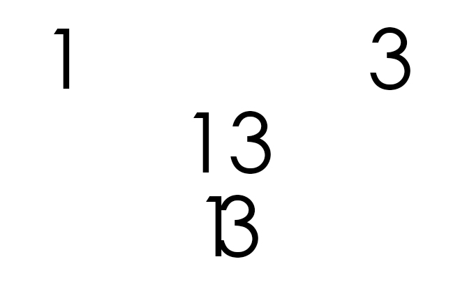
ILLUSTRATION: The amount of space between the numbers 1 and 3 changes the meaning. On the row, most people will perceive a separate 1 and 3. The second row, a 13. The bottom row, the letter B. One unintentional consequence of getting things too close is mergers. A merger occurs when two objects are physically distant from each other (which we can see with our own eyes) but end up appearing as if they overlap in the photograph. For example, a sun touching the horizon can render a pleasing sunburst. Even though it looks as if the sun and horizon meet in the image, the sun doesn’t physically contact the horizon—and if it ever does, we’re all in super big trouble. More often than not, though, mergers happen accidentally, when we’ve not been mindful to notice all the visual elements in our frame and the relationships among them. These intersections cause unnecessary tension, distraction, and trapped space. Moving your camera to the left or right, up or down, usually resolves mergers.
- Sloppy edges. Sometimes we get so excited about a subject or our scene that we see only what we wish to see (which is usually our main subject). Out of focus branches, bright tones (called “light leaks”), and other distractions along the edges of the frame will pull the viewers eye out of the frame. Conduct a “Border Patrol” (in Arizona, this is funny…or maybe it’s not…) where you search the edges of your frame looking for things that don’t support your visual message. If you notice unwanted elements while processing—that is, when it’s too late to address in the field—use a vignette to darken the edges and hide them. Vignettes solve all world problems. All, that is, except COVID-19 apparently
- Inappropriate placement of the subject: Put down the Rule of Thirds and step away from the constraints. I have heard just as many times as you have that if you position your subject in the center of the frame—and not one of the four intersecting points of the tic-tac-toe grid as the Rule of Thirds suggests—you will spontaneously combust. Except no one has yet. And no one will. Per human perceptions, viewers interpret things positioned in the center of the frame to be at rest. If you have a subject—a rock, flower, tree—that, in fact, isn’t moving and you wish to show it in repose, you’d position your subject in the center of the frame on purpose so your viewers understand your intent. What tends to happen with composition is a mismatch between the photographer’s goal and the viewer’s interpretation. If you position the rock, tree, or flower on the edge of the frame, the subject will pull the viewer’s eye away from the rest of the composition. If you wish to convey rest, your viewers will see movement—a breakdown in the communication. If you position the rock, flower, or tree in between the center and the edge, you’ll create dynamic energy. Again, if you wish to convey rest, your viewers will see movement—another breakdown in communication. The opposite of this is true too. If you wish to express movement and energy but center the subject, viewers will interpret your subject as being at rest. To avoid this, pay attention to the words you use to answer “What am I responding to?” If you say, “I like the way the rock feels like it’s falling away from the cliff,” then positioning the rock on the edge of the frame. If you say, “I like the way the rock seems frozen in time as the water flows around it,” then consider centering the rock. You will not spontaneously combust, I promise.
- Half-and-half: No, I’m not talking about what you put in your morning coffee. I mean accidentally placing a dominant horizontal line through the middle of the frame. A centered horizon, a shoreline, or otherwise straight triggers the viewer to see symmetrical balance (meaning, the viewer expects to see the same elements on the bottom half repeated at the top half if you were to fold the photograph like a greeting card along that line). When a photographer has not arranged the visual elements to convey this symmetry, it confuses the viewer. Viewers subconsciously ponder, “Should I look at the land or look at the sky?” They can’t decide, so they stop engaging with the image. The symmetry divides. Now, the key word in this bullet point is “accidental.” There are excellent reasons to split the frame half-and-half. Like when you wish to intentionally convey symmetry. Like with water reflections, for example, where the symmetry acts to unite and create a sense of order.
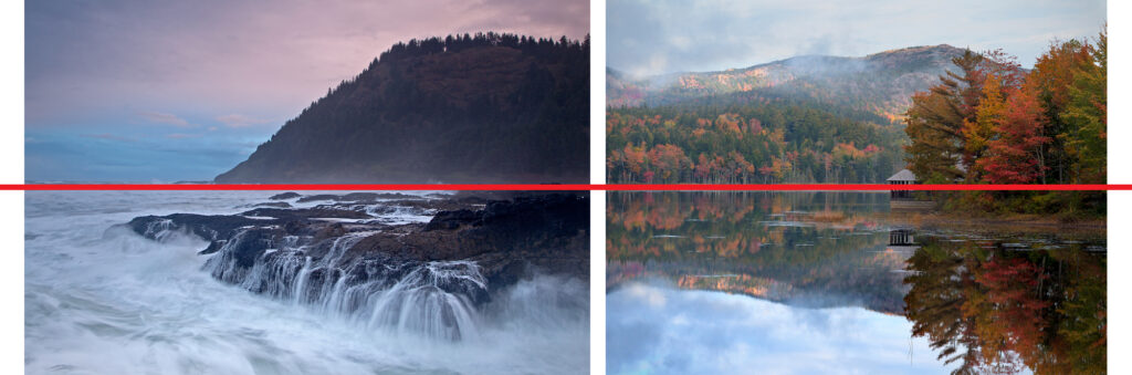
PHOTOS: Two examples of symmetrical balance. Imagine folding these two images in half along the dominant horizontal line (indicated in red). On the left, the triangular shape of the rocks in the foreground do not align with the triangular shape of the headland in the background. The asymmetry in a symmetrical composition feels uncomfortable to look at. To resolve this, I would have had to move three or four feet to the left, which would have put me squarely in the crashing waves. On the right, while the boathouse and trees are not perfectly symmetrical, they line up enough (and are small enough in the frame) for our brains to perceive symmetry in a symmetrical arrangement. - Standing too far away from the subject. If you want your viewers to have any chance of feeling an intimate connection with your visual message, you must first feel the intimate connection yourself, then convey it through your compositional choices. To make your viewers feel like they are in your picture, get in your photograph. Get close, then get closer. While I’ve seen a fear of getting too close originate from a thousand-foot cliff preventing forward movement, it more often stems from a simple unawareness and/or a discomfort with depth of field. A good number of the grand landscape photographs I make with my wide-angle lens, like the one at the top of this post, start with a similar approach: position myself about a foot or so away from my foreground, lower my tripod to a little above knee height, and tilt the camera down. With my 7mm lens on my Olympus OMD EM1 Mark II camera set to f/8, my hyperfocal distance is 1.39 feet (which means, if I place my focus point at 1.39 feet, everything thing from about 0.75 feet, or roughly 10 inches rounded up, to infinity is in focus.) At f/22, the hyperfocal changes 0.5 feet. If this is your concern, visit my earlier “Another Dose of Depth of Field” article.
Attitude can go a long way in our happiness in our learning journey with photography (or anything). It’s all too easy to focus only on the negatives. As you progress, don’t forget the positives. Growth comes from a balance acknowledging when things didn’t go quite as well as we hoped with celebrating our successes when they do. Besides, as Thomas Edison said, “I have not failed. I’ve just found 10,000 ways that won’t work.”
As far as I’m concerned, no matter what images my workshop participants take home with them, they’ve done so much more beyond failing or achieving. They’ve tried. And I’m proud of them all for having the courage for doing just that.
Be well, be wild,
~Bubbles
Have a question about photography, art, and/or the creative life? Need some advice? Send your question to Dear Bubbles at [email protected] to be possibly featured in a future column post. (If you’d prefer a different display name than your real first name, please include your preferred nickname in your note.)

Switching Gear