Color or Black and White?
Dear Bubbles: I loved how one of my images looked in B&W in camera, but when I put it on my computer and saw it, I’m not sure what to do with it. I may actually like it better in color. How do I decide, black and white or color? ~Shirley
Dear Shirley:
Such the conundrum, isn’t it? Most, not all, of us photograph in color, then occasionally hem and haw over whether we should keep it as photographed or convert it into black and white (usually after feeling like the color version just doesn’t “do it” for us.) There are those, though, who “see” and choose to express their photographic art in black and white instead of color, though, like my dear friends Chuck Kimmerle and Michael Gordon. The beauty–and perhaps the complexity–of art is that you, as an artist, can express things however you wish, often in a multitude of different ways, and they all be correct. While I’ll provide some direction on how to decide between color and black and white, you don’t necessarily have to choose. You can like your image in both treatments. Both can be right answers.
With black and white photographs, we’re primarily concerned with tonality. Tonality, which is also called lightness or value, refers to the range of tones from light/white to dark/black through midtones/grey (the “tonal range”). With color photographs, we’re not only dealing with tonality/lightness, but also color hue and saturation.
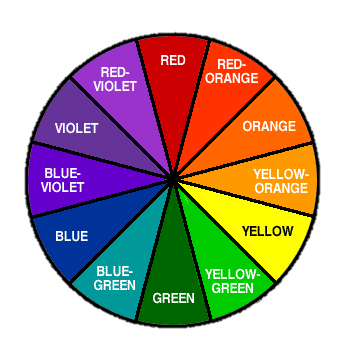
Three primary colors–red, green, and blue-stand on their own as individual colors. They can also be combined to create other colors. The color wheel gives us a more in-depth look at these variations:
Color carries some of the most dominant visual weight in a photography (as compared to other design elements like lines, shapes, positioning, proximity, etc.). Cool colors like purples, blues, and greens tend to recede into the background. We don’t notice them as quickly as the warm colors. They don’t carry as much visual weight in our images. Warm colors like reds, oranges, and yellows tend to grab attention with reds attracting the quickest notice with viewers. Think about what red symbolizes. Blood. Danger. Love. Fire. Stuff we should pay attention to. That’s why stop signs and fire hydrants are red and not blue.
On top of visual weight, different colors convey different meanings. Evolved over time from ancient cultures, today, perceptions of certain colors vary from culture to culture. It’s a universal visual language, but the dialects can–and do–differ.
People in Western cultures generally tend to interpret certain colors as follows (not meant to be an exhaustive list of representations):
- Red: aggression, energy, excitement, impulsiveness, passion, power, danger, anger, romance, strength
- Orange: warmth, enthusiasm, compassion, enjoyment, fun, encouragement, optimism
- Yellow: hope, happiness, freshness, joy, enlightenment, positivity
- Green: renewal, growth, harmony, prosperity, greed, jealousy,
- Blue: calm, creativity, peaceful, intelligence, sadness, cold, freedom
- Purple: imagination, spiritual, mysterious, magic, nobility
What comes to mind when you hear or see these different colors? It’s worth noting, as it’ll help you match concepts expressed in verbal language with visual language when it comes time to photograph–and decide whether the color(s) enhance or distract from your intended visual message.
How does black and white fit into this?Individual colors correspond to a given wavelength of light. Black and white do not have assigned wavelengths. Black is the absence of color. White is the summation of all colors. Thus, black and white are not recognized as true colors in physics. In art, we utilize black and white as additional colors even though they don’t appear on the color wheel as their own individual piece of the pie.
As an aside, you might have heard black and white images called “monochromatic,” which technically is not the same as black and white. Monochromatic means “containing or using only one color” (per the Oxford Dictionary). A monochromatic image could display black or white, but the kind of black and white images we usually talk about are not truly monochromatic. The images we create are technically always multichromatic, whether in color or black and white, which includes a broad spectrum of grey. Even though we use the terms “black and white” and “monochromatic” interchangeably, it’s probably more accurate to say “greyscale,” (which arguably doesn’t have the same ring as “back and white.”) Grey–or gray, which is the more popular spelling in the U.S. I just like to be different–is a combination of black and white intensities. This means it’s a blend of no color and all colors simultaneously. (Mind blown!) It’s considered a color without color. It’s also not on the color wheel. Poor grey…I digress…(Consider that your daily dose of random useless knowledge!)
Images depicted in black and white strip out the various perceived color associations and direct the viewers focus to tonality and contrast instead. Light tones and whites act like reds–they grab attention. A viewer’s eye goes to the brightest part of the frame (and/or red hues) first. Light tones reveal detail. Dark tones and blacks act like blues and purples–they recede into the background. They hide detail. When light and dark work together in a visual representation, with or without color’s involvement, we see things like contrast, structure, shape, and texture.
However, while black, white, and grey aren’t on the color wheel, they still each carry their own meanings:
- Black: strength, power, authority, serious, formal
- White: purity, innocence, cleanliness, faith, perfection
- Grey: fogginess, uncertainty, dull, emotionless
Black and white images also come with additional perceptions beyond “color” associations. It’s often said these types of images look more traditional and timeless. Stark. Striking. Bold. If we’re aiming for our viewers to see a certain emotion or concept through our work (I am), these opinions also matter and should be taken into consideration when we’re composing our photograph.
When I’m in the field questioning my composition, I ask more questions to help me decide whether I’ll deliver the image in color or black and white (er, I mean, greyscale). To work through this, look at your color image, and ask yourself:
- What do I wish to express in my image? Pay attention to key concepts and words!
- What colors are present in my composition?
- What do those colors say?
- Where are the brightest parts within my frame and how do they work with the colors to attract attention?
- Where are the darker parts within my frame and how do they work with the colors to recede into the background?
- Do the colors and light work together to help me express my desired message? Or do they take away from it?
Let’s run through an example so you can see how this works, at least how it does in my little brain.
The photographs below are from a visit to White Horse Lake on the outskirts of Flagstaff, AZ. Truth be told, I had no plans to photograph on the quick overnight trip. I just wanted to camp, maybe stand-up paddleboard a little. You know, just get some fresh air on a summer evening.
When I arrived, a prescribed fire was raging just a few miles west of the lake. I considered going somewhere else, but the gentle evening breeze started pushing the smoke away from the lake. I stayed. I paddled until the sun went down. I slept. In the stillness of the night, the ashy air crawled through the forest. When I woke up, I couldn’t see the lake, which was less than 300 feet away from my camp. Instead of leaving immediately, I grabbed my camera…
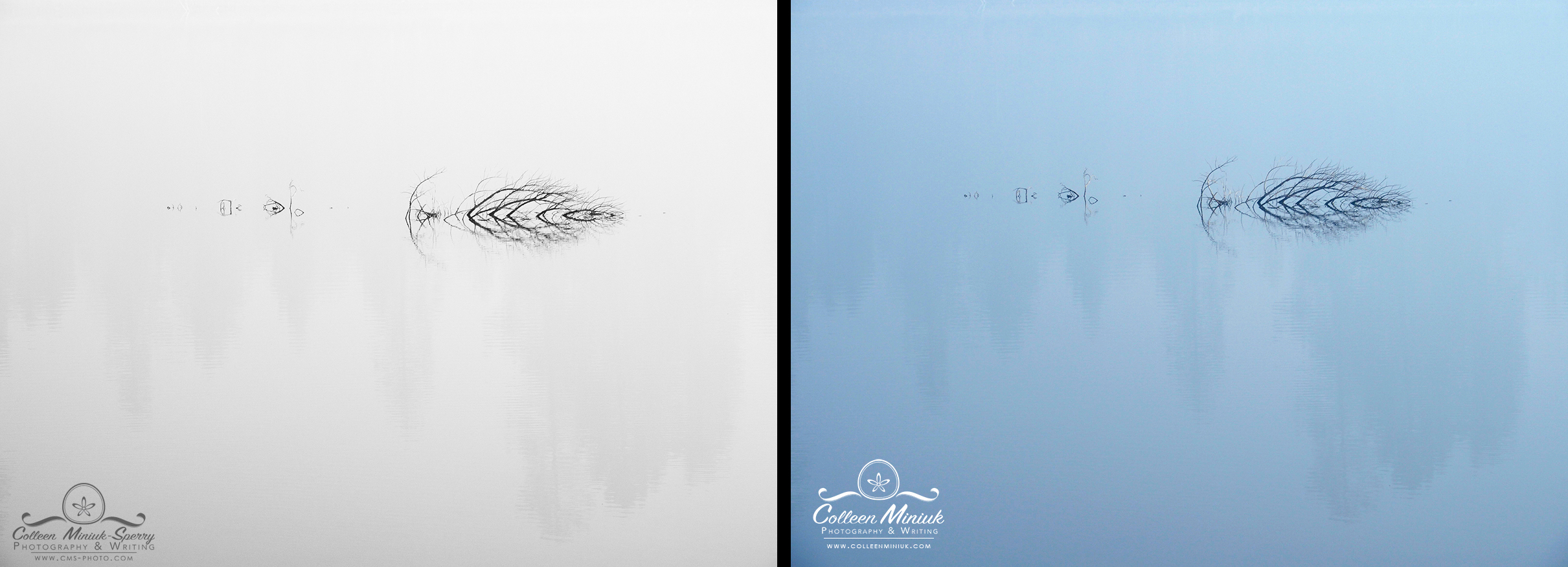
When I saw this scene, I instantly said, “Reflections of what remains.” That became my title of my photograph before I snapped a frame (an approach I use often and highly recommend…). I especially liked the starkness of the tree branches, going so far to call them skeletal. I wanted to show the contrast between life and death. I wanted to show that this tree was once very alive like the evergreens in the foreground reflection. I wanted the image to feel ghostly and wistful.
Before we analyze this image further, pay attention to some key words in that last paragraph: starkness, skeletal, contrast, ghostly, wistful. If we know the words and concepts, we can match this verbal language with the visual language of color…but before we do that, let’s keep digging…
The image on the right is the original, unprocessed RAW image out of my camera (obviously converted to JPG so I could display on this post). Little sun light penetrated the thick smoke, causing my camera to record a substantial amount of blue in the initial frame. Consulting the list above, the color blue conveys “calm, creativity, peaceful, intelligence, sadness, cold, freedom.” The brightest part of the frame, which wasn’t very bright, was the water in the foreground. The darkest part of the frame was the tree branches and their reflections. There isn’t much contrast between lights and darks, so the variance in visual weight between the brightest part of the frame and the darkest part of the frame is kinda low. Both the light and dark areas are blue, so the blue doesn’t enable one tone or the other stand out. I know I said earlier that blues tend to recede into the background, which would mean we wouldn’t pay much attention to it. Because the entire frame is blue, though, it’s so overwhelming that it serves to grab and hold the viewer’s attention. It’s drowning (haha, pun intended) the focus on the tree branches and the reflections in the water.
Now we try to match everything up with our visual message. Is that what I want to convey?
I didn’t want to depict calm, creativity, peaceful, intelligence, or freedom. Sadness and cold do come closer to my desired “starkness, skeletal, contrast, ghostly, wistful.” When I think of “skeletal” and “ghostly,” white comes to mind. Not blue. When I “starkness” and “contrast,” I think of black. Again, not blue. So the perceptions of color in the original image do not fit with my intended message. It distracts. If I keep it, viewers will see blue and make similar associations, which differs from what I wanted to say. You know what that means? Adios color!
So here’s the thing. If I would have used the words “calming” or “peaceful” to describe what I wanted to express in my image, then keeping the blue (albeit toning it down a bit) could have been a right answer. I could have also warmed the white balance up to a more orange tint to convey warmth or fire even. Also a right answer. Neither blue or orange, however, aligned with what I was trying to visually say, so not right for me for this image.
Now, I know you’re probably thinking, but hold up there, Bubbles! The branches are black and you said “skeletal” which means they should be white. I hear ya. But that’s not what nature delivered to me. Think of the terms more metaphorically, less literally. It’s art, after all. The black branches do convey strength, and the greys fit with the uncertainty and that air of wistfulness I was going for. I intentionally left out bright tones to keep the mood somber.
I knew confidently when I developed my title that I’d render the final image in black and white. That said, I still recorded the image in RAW format and processed it into black and white on my computer at home.
(Pro tip: If you’re shooting in RAW, you can visualize the photograph in black and white at the time of capture by setting your Picture Style to Monochromatic. You can see the results instantly while still recording RAW data, which preserves your options to depict the final image as color, black and white, or both. In addition, this is an excellent way to train your brain to see tonality–while not getting overwhelmed by color–which will help you make faster assessments and decisions about how to display your images. However, if you’re shooting in JPG format and set the Picture Style to Monochromatic, keep in mind the image you see on your camera’s LCD and on your computer will appear in black and white. You’ll lose your option to present colors. If you aren’t sure how you’ll process your frame and you’re shooting in JPG, keep your Picture Style on the default or another color-related setting (like Vivid or Natural). In processing software, you can always drop color out, but you can’t always add color back in.)
The key with all of this is that you are making a deliberate choice. Its your photograph. It’s your art. You get to decide! Hopefully this all helps puts a little more color into a decision that isn’t always black and white.
Be well, be wild,
~Bubbles
Have a question about photography, art, and/or the creative life? Need some advice? Send your question to Dear Bubbles at [email protected] to be possibly featured in a future column post. (If you’d prefer a different display name than your real first name, please include your preferred nickname in your note.)

Modus Operandi